Samolet Select is the premium brand of Samolet, one of Russia's largest residential developers, launched in 2023. It presents homes as a curated collection, the way a museum presents art, haute couture or collectible wine. The first project is NOVA, a residential complex near Kutuzovsky Prospekt by the Setun river valley in Moscow. My role was Brand & Creative Director, from the name and the idea to the brochure, the sales office and the website. Everything shown here went to market.
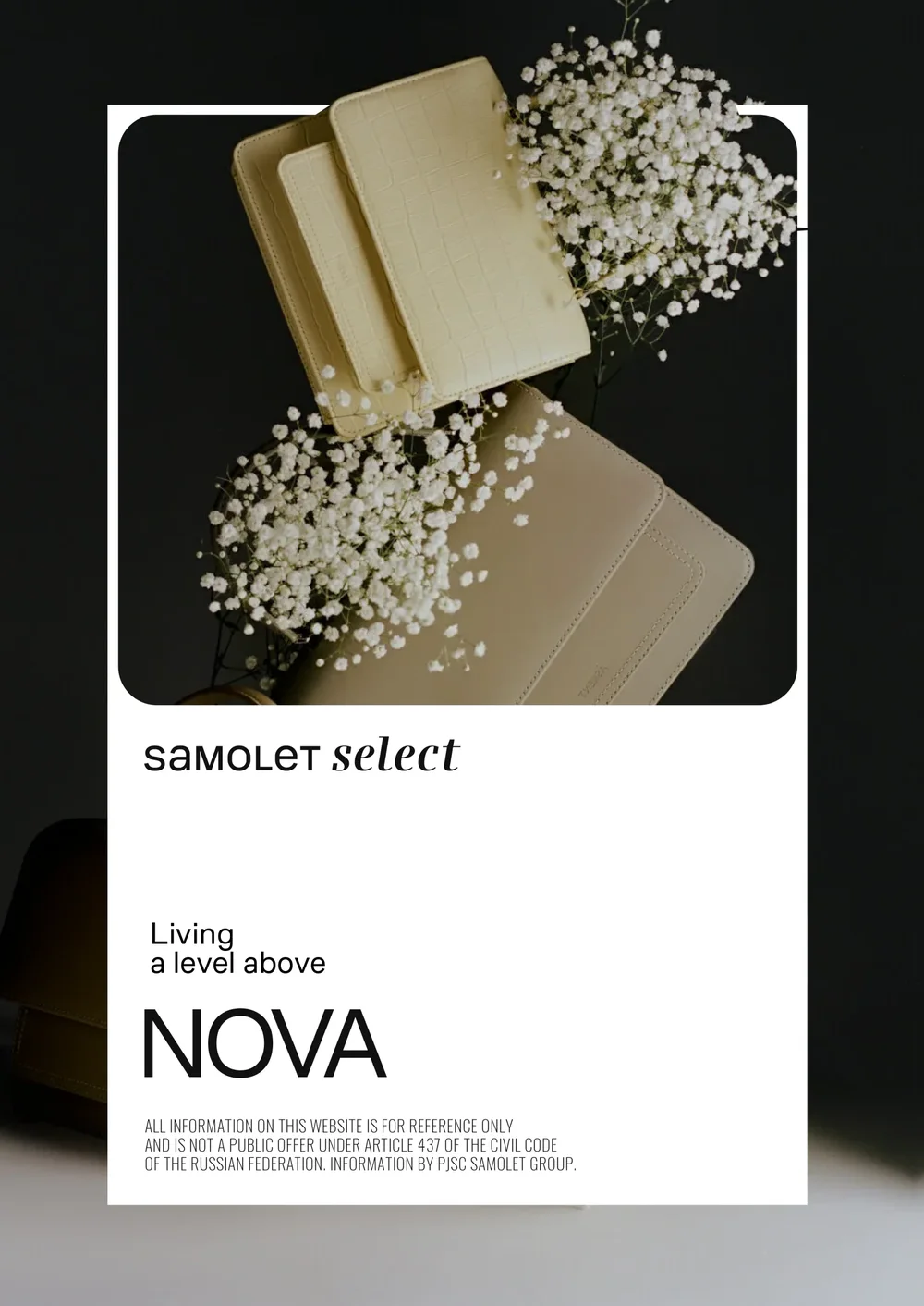
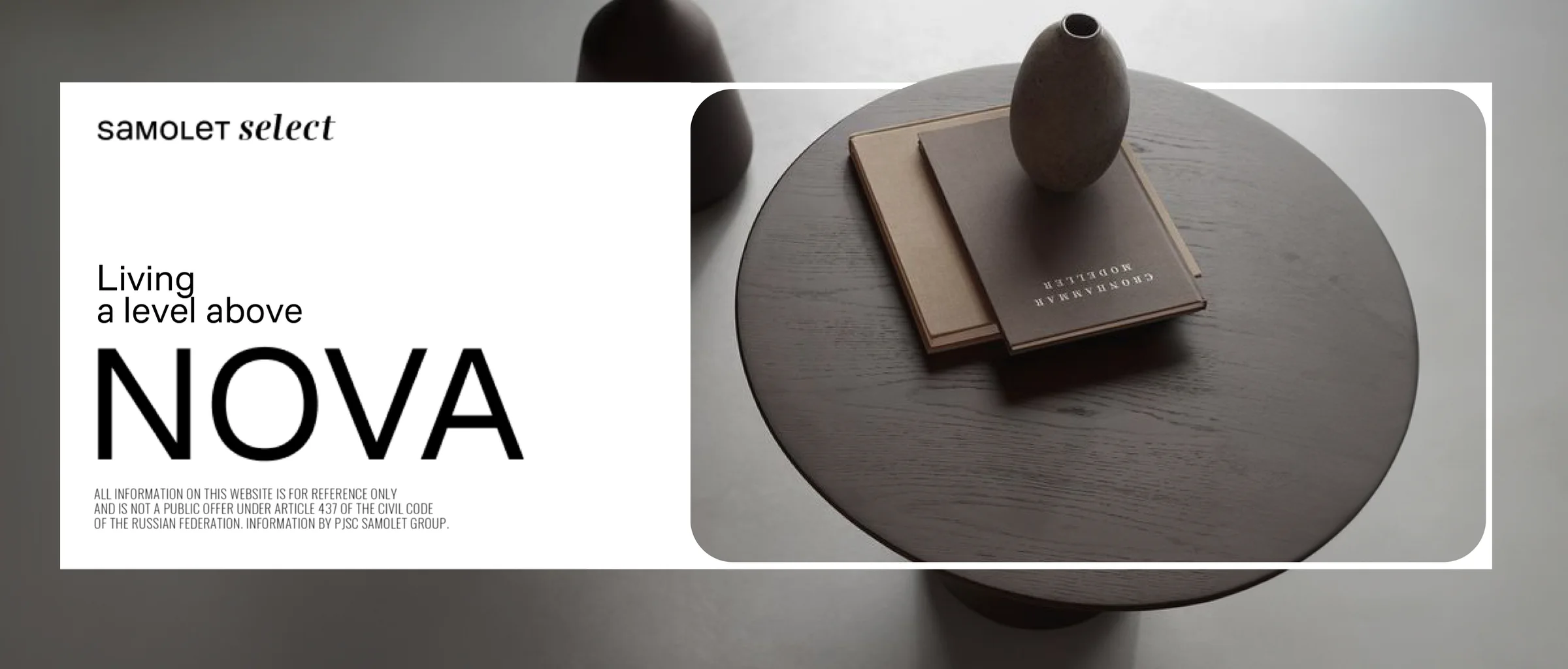
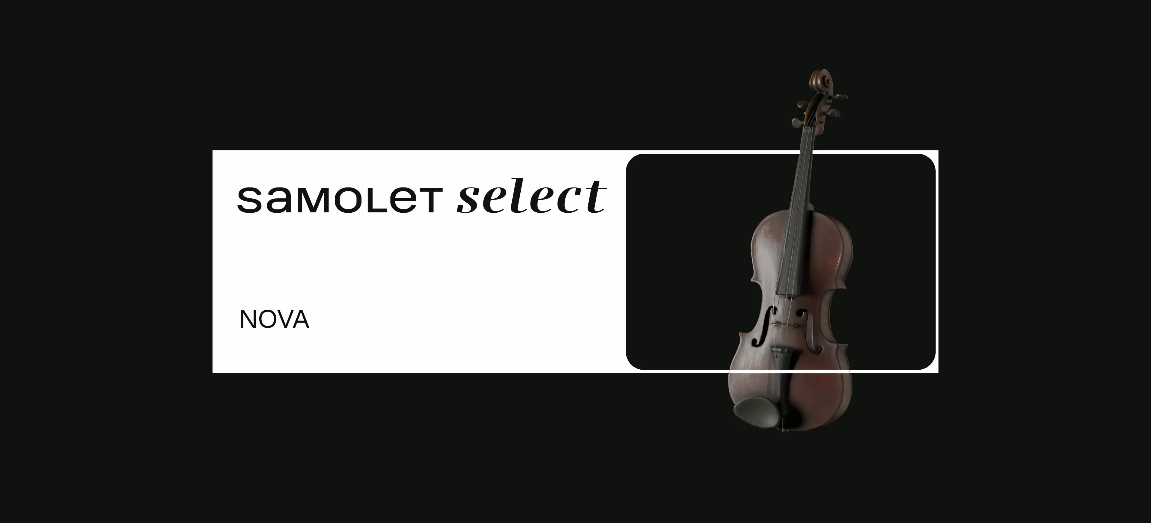
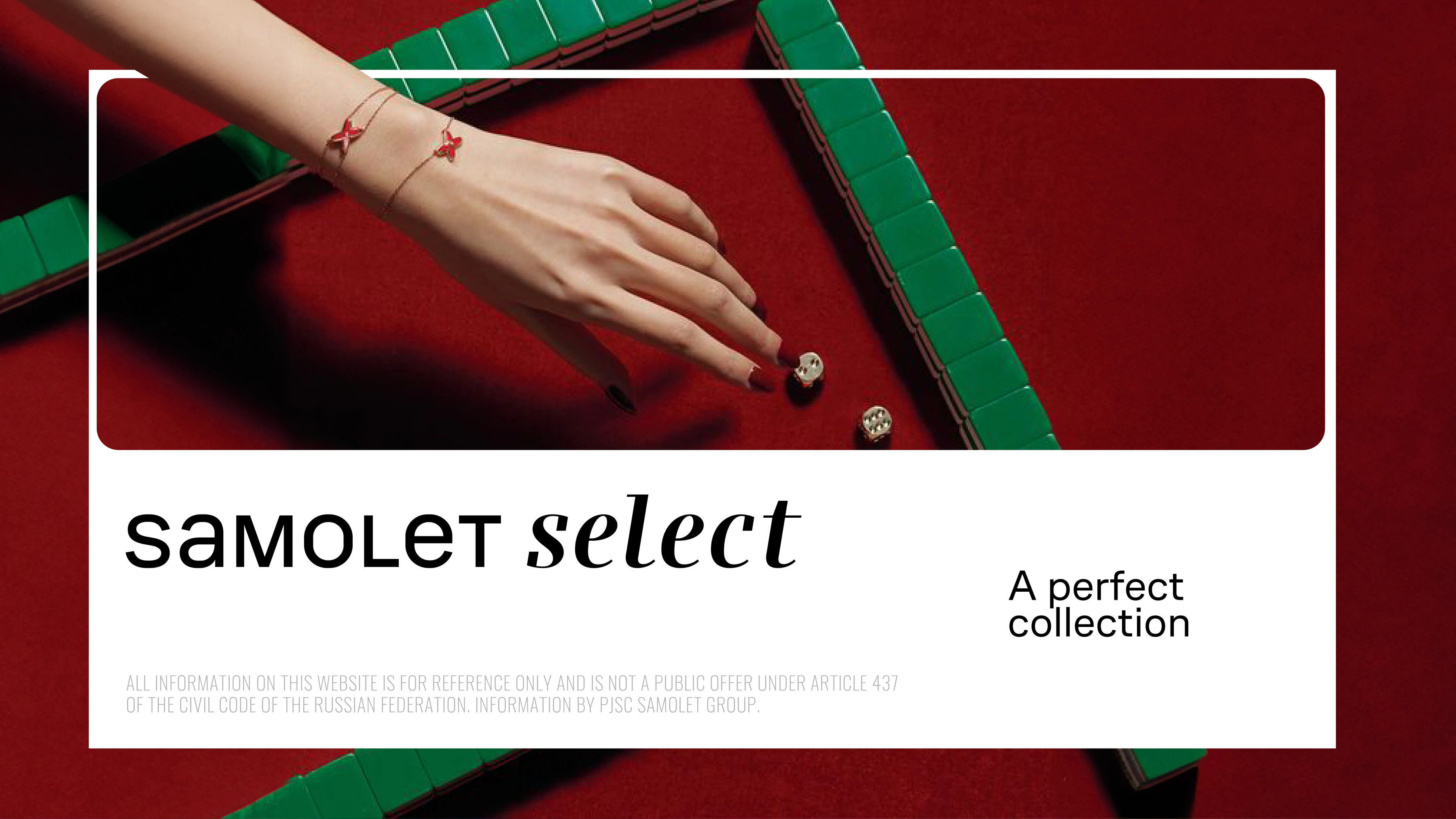
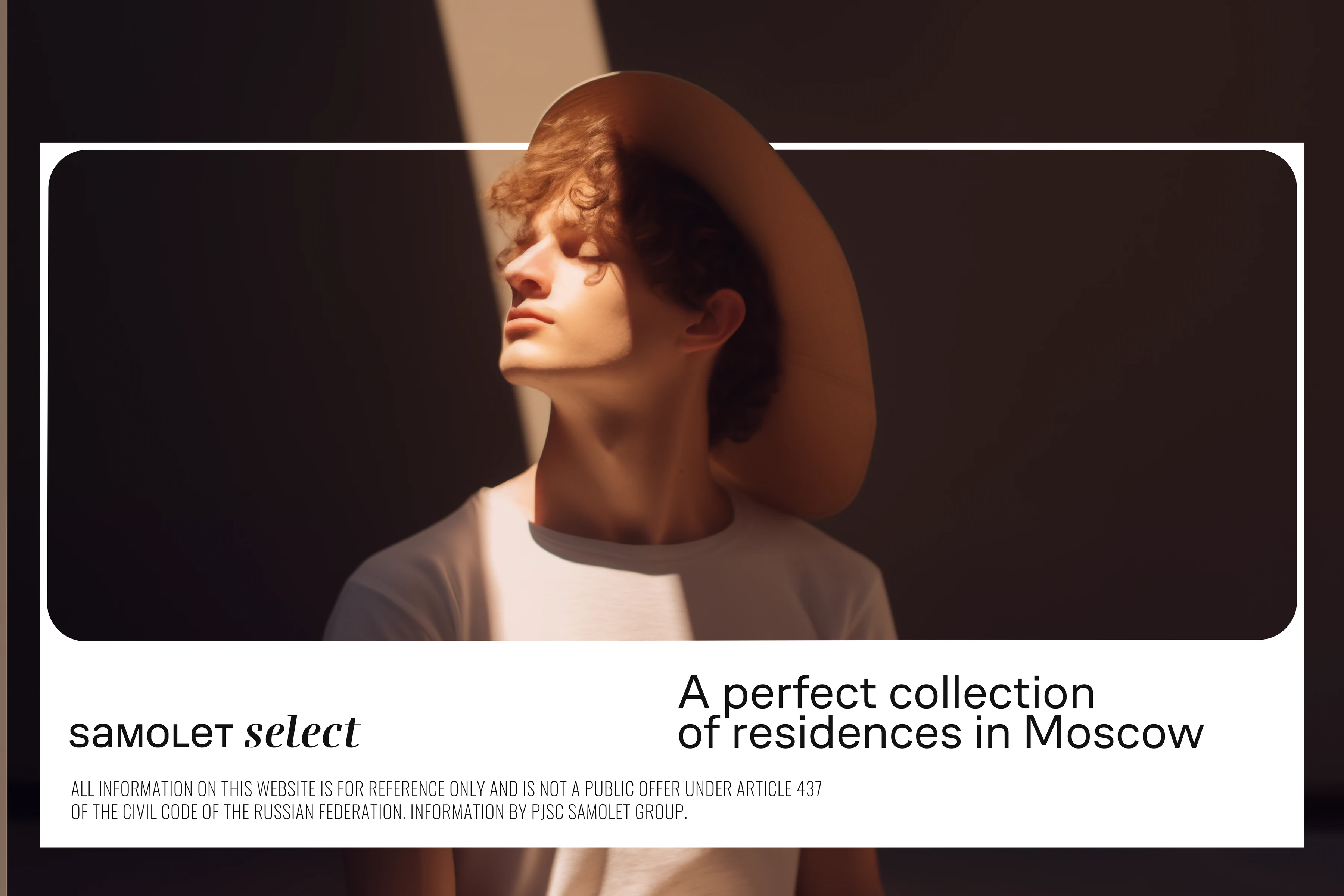
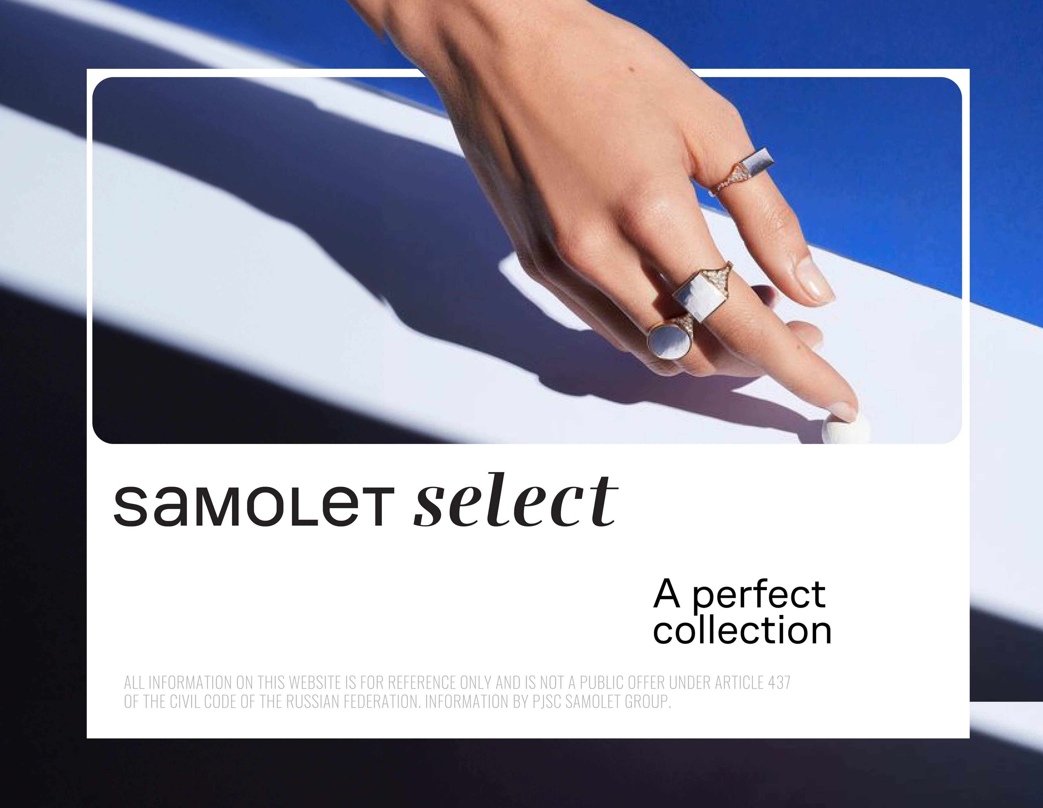
Select treats a home the way a collector treats a rare piece: it is chosen with care, kept for years and lived with every day. Every Select project goes further than the market standard, and the identity turns this promise into one gesture. A thin frame holds the subject the way a gallery frame holds a work of art, and the subject always steps beyond it. The frame stands for the standard, and stepping out of it is the brand. One rule is enough for every format, from a film to a gift bag.
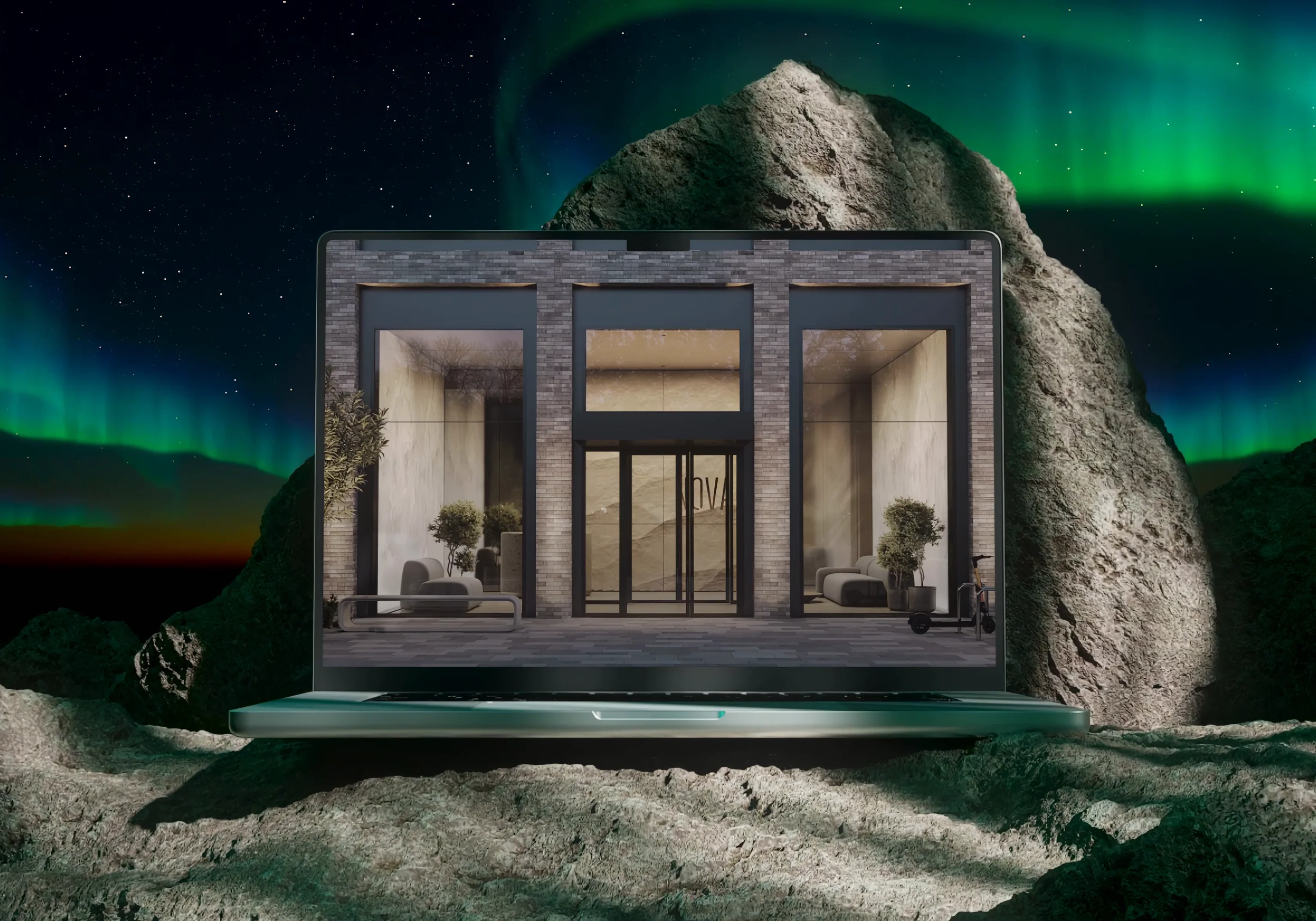
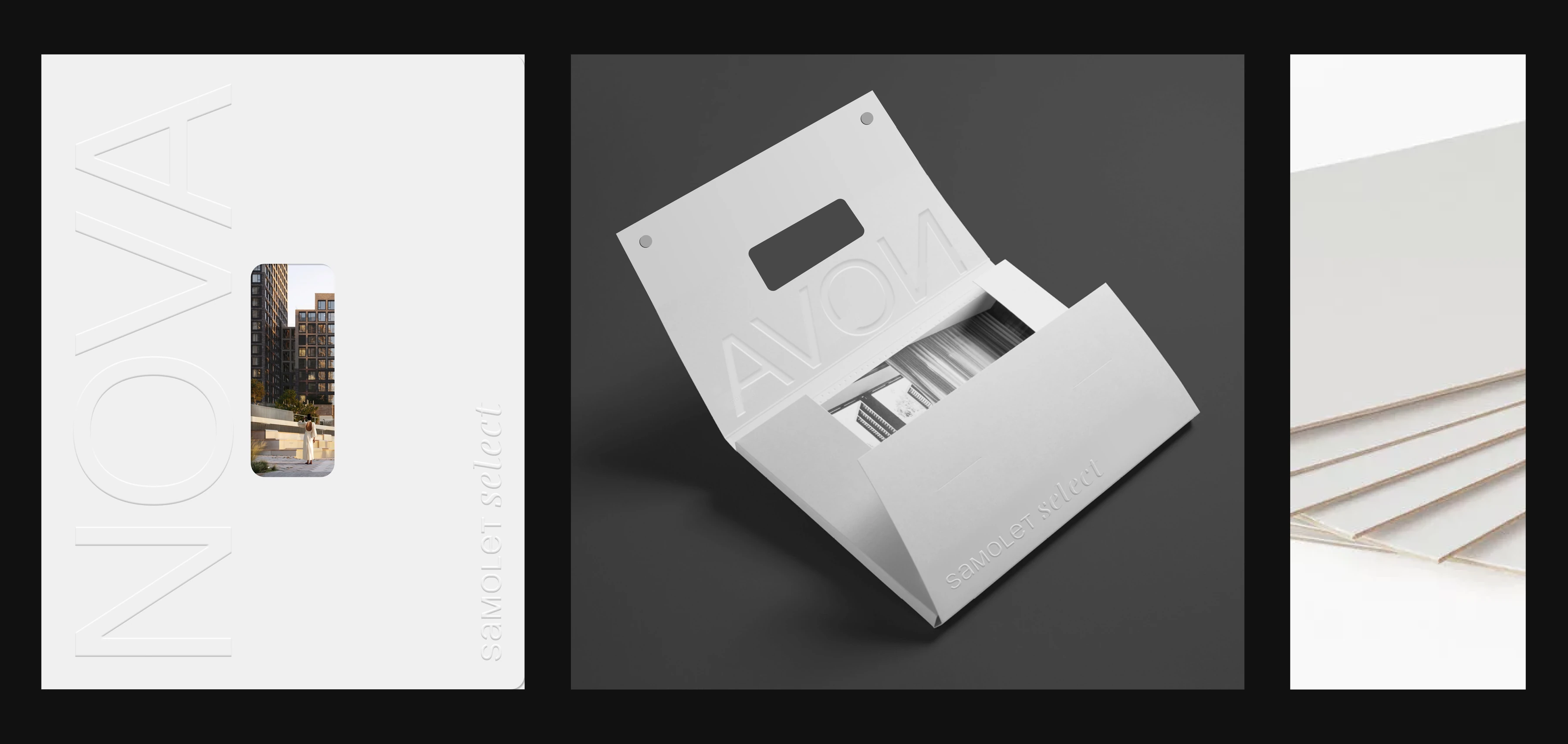
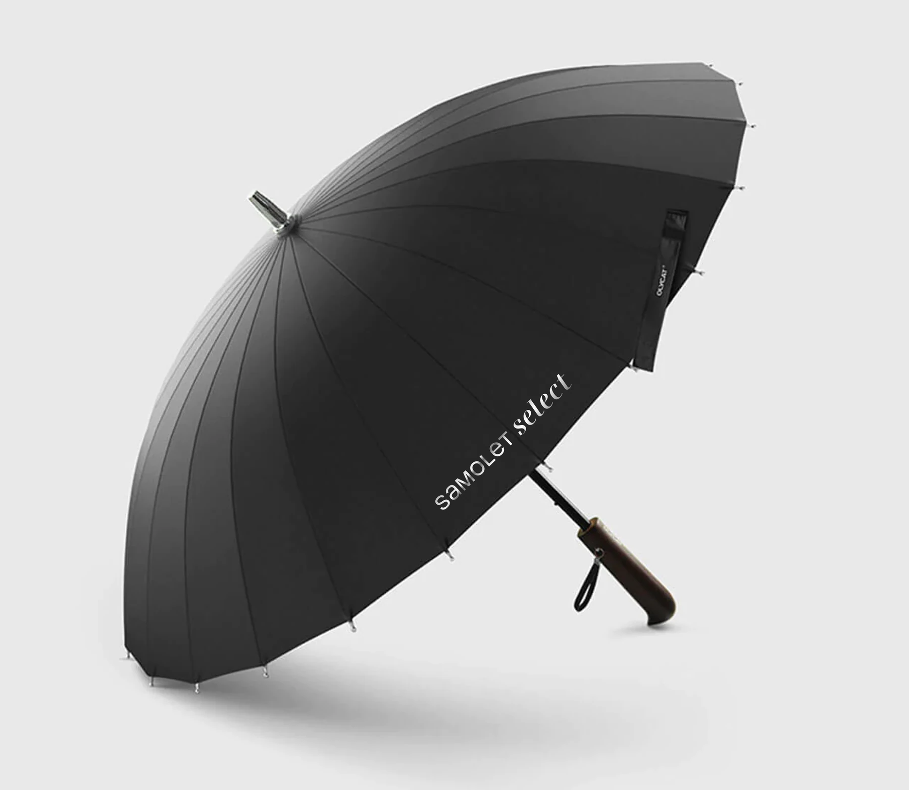
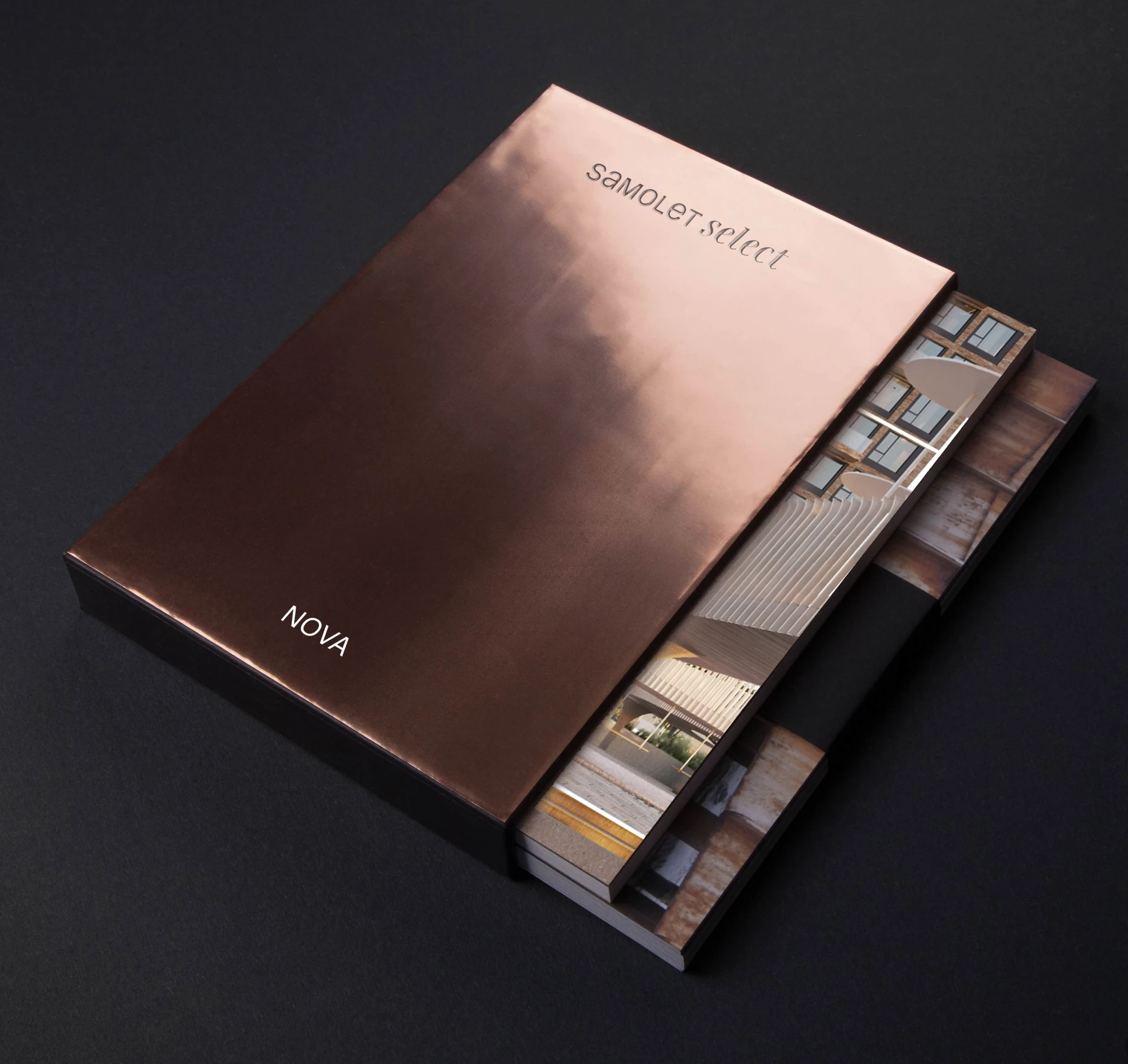
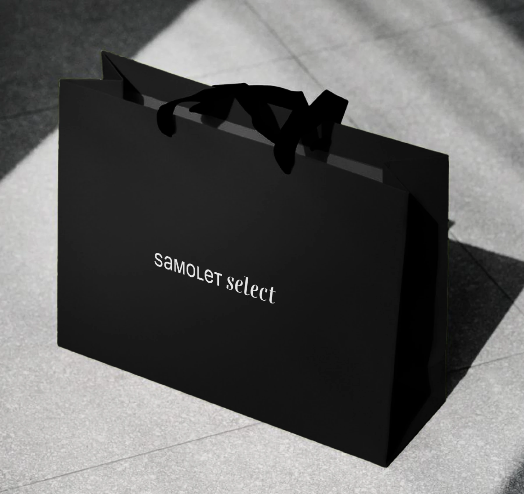
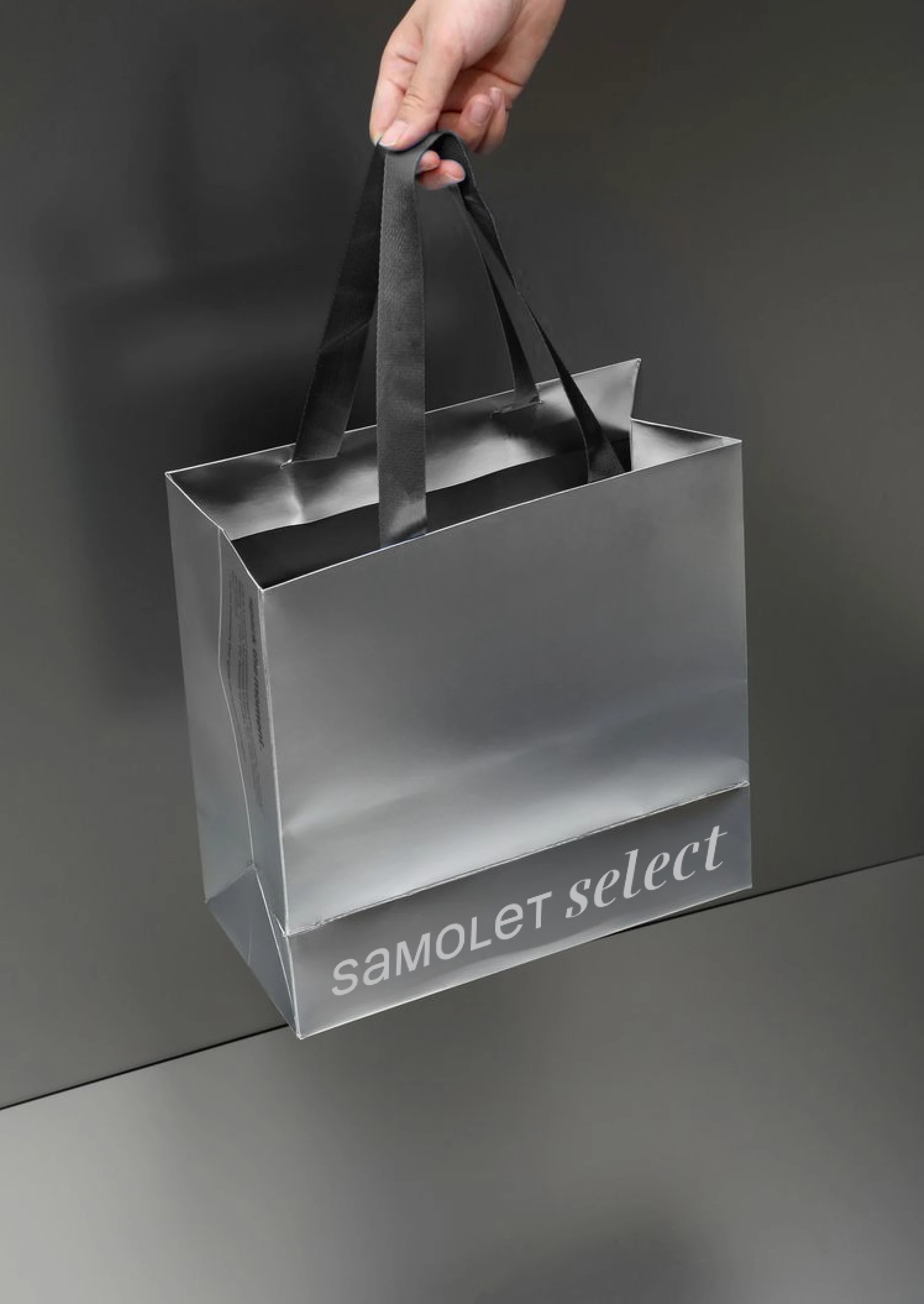
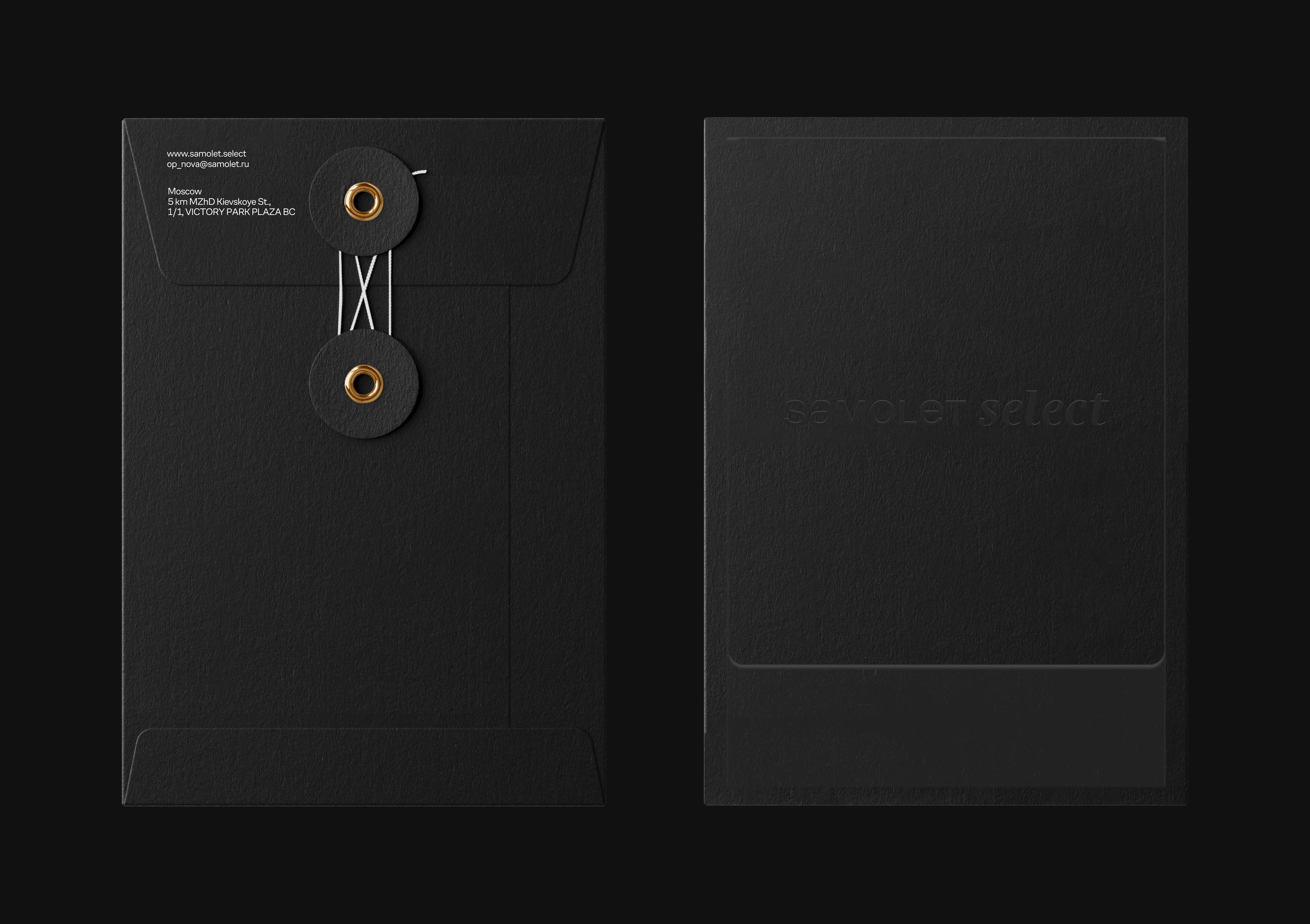
Select stands for personal choice. The projects are numbered the way a collection numbers its pieces: NOVA, the new one, opens it, and Secundus and Tertius follow. Premium projects are rare, so the count is never meant to reach two digits. The same thinking shapes everything a buyer receives after a visit. The folder, the bag and the brochure case are made as objects worth keeping, so the first piece of the collection goes home with the buyer long before the keys do.
The campaign sells a way of living through people and the things they choose to live with: a sculpture, a chair, a ring, a glass of wine in the evening light. Each subject breaks out of the frame, so every image repeats the promise of going beyond the expected. The white plate stays the same and stays quiet, which lets the subject change from one format to the next while the brand stays recognisable at a glance.
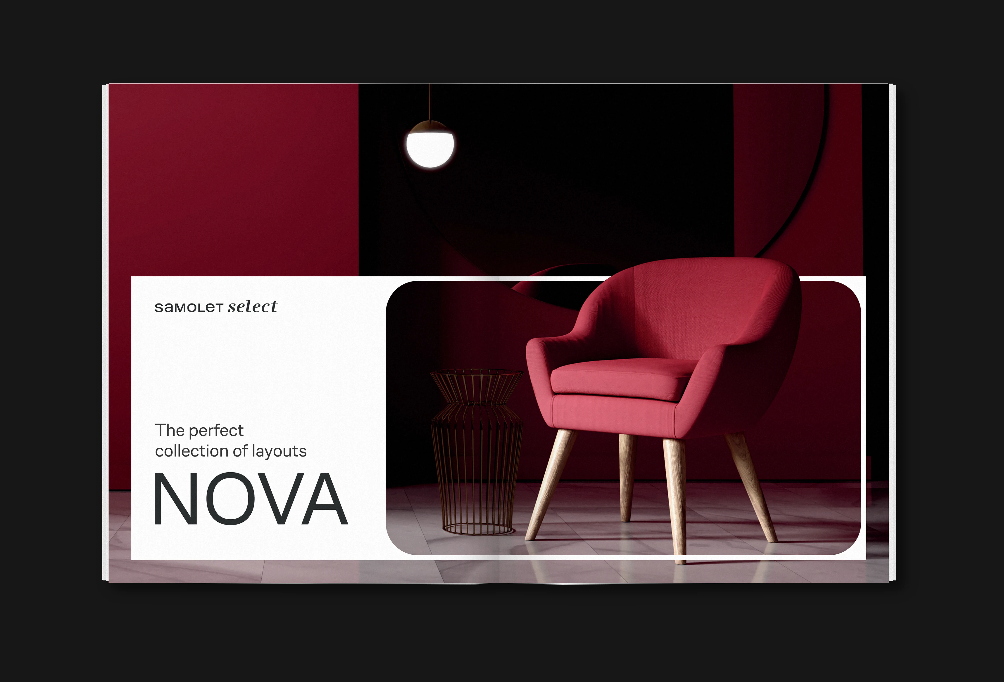
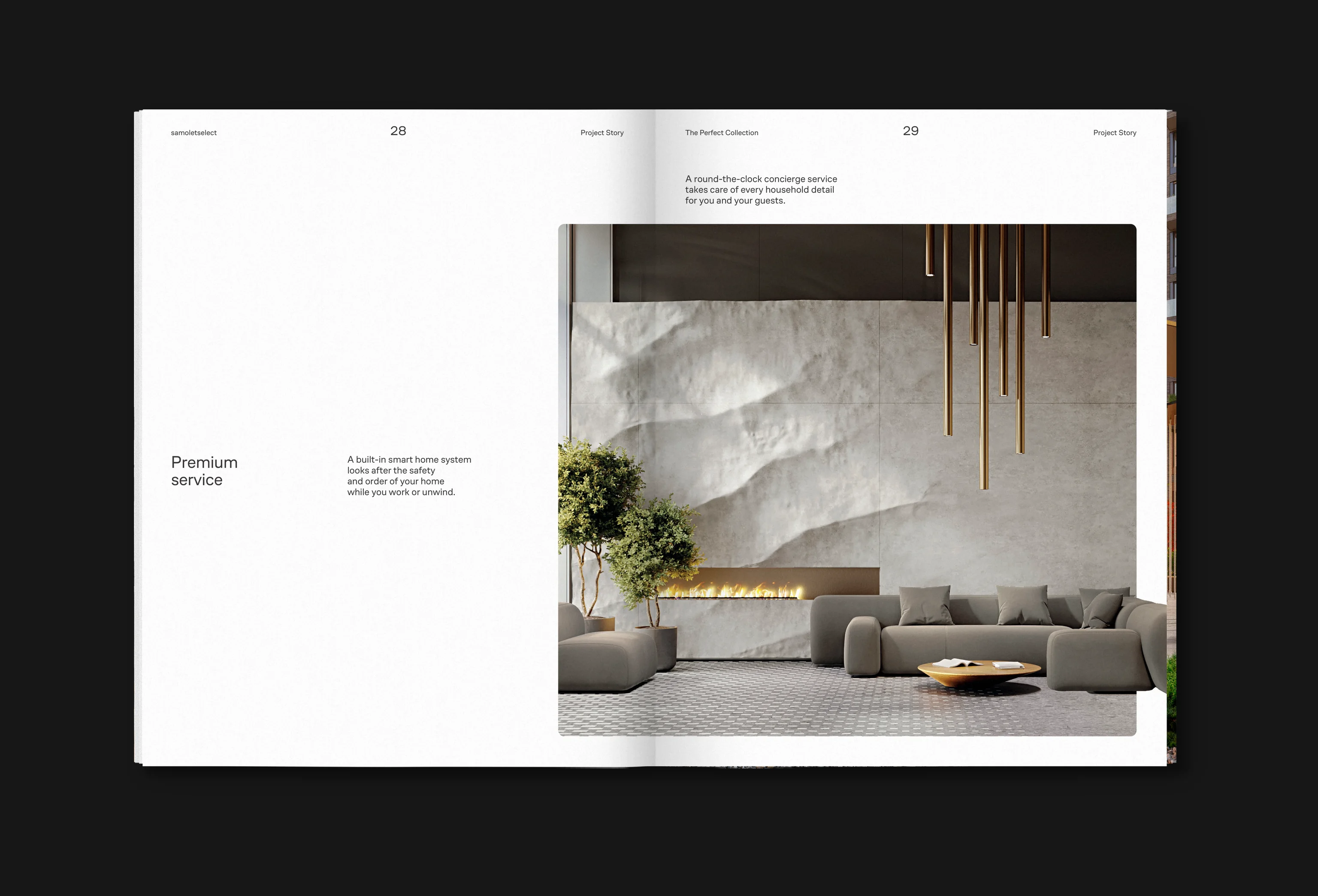
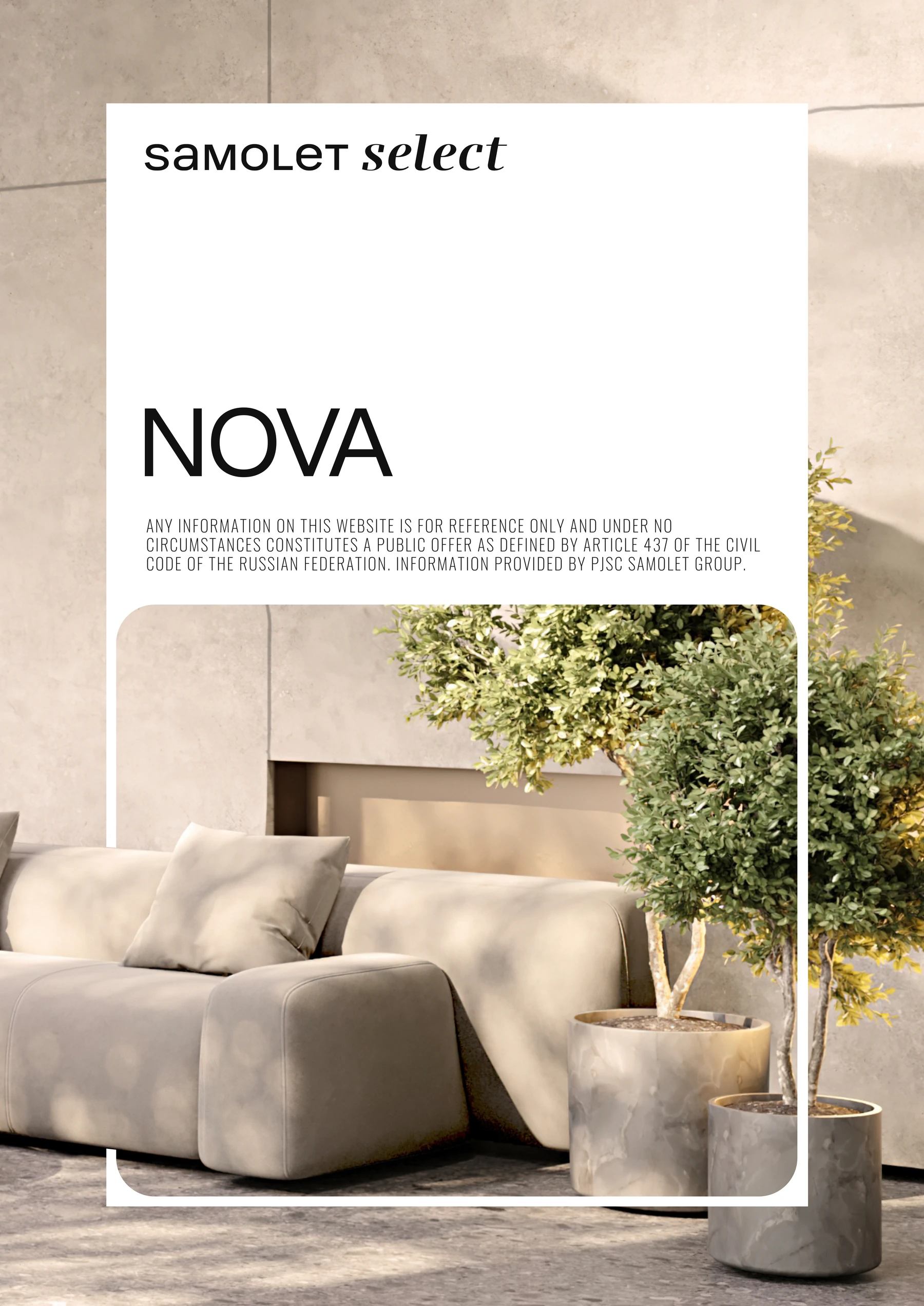
The brochure is written as a catalogue of a collection. NOVA is presented piece by piece: the place by the green Setun river valley, the architecture, the lobbies, the service and the homes. Each spread gives one piece room to breathe, the way a gallery hangs one work per wall. The calm pace does the selling and gives the reader time to imagine living there.
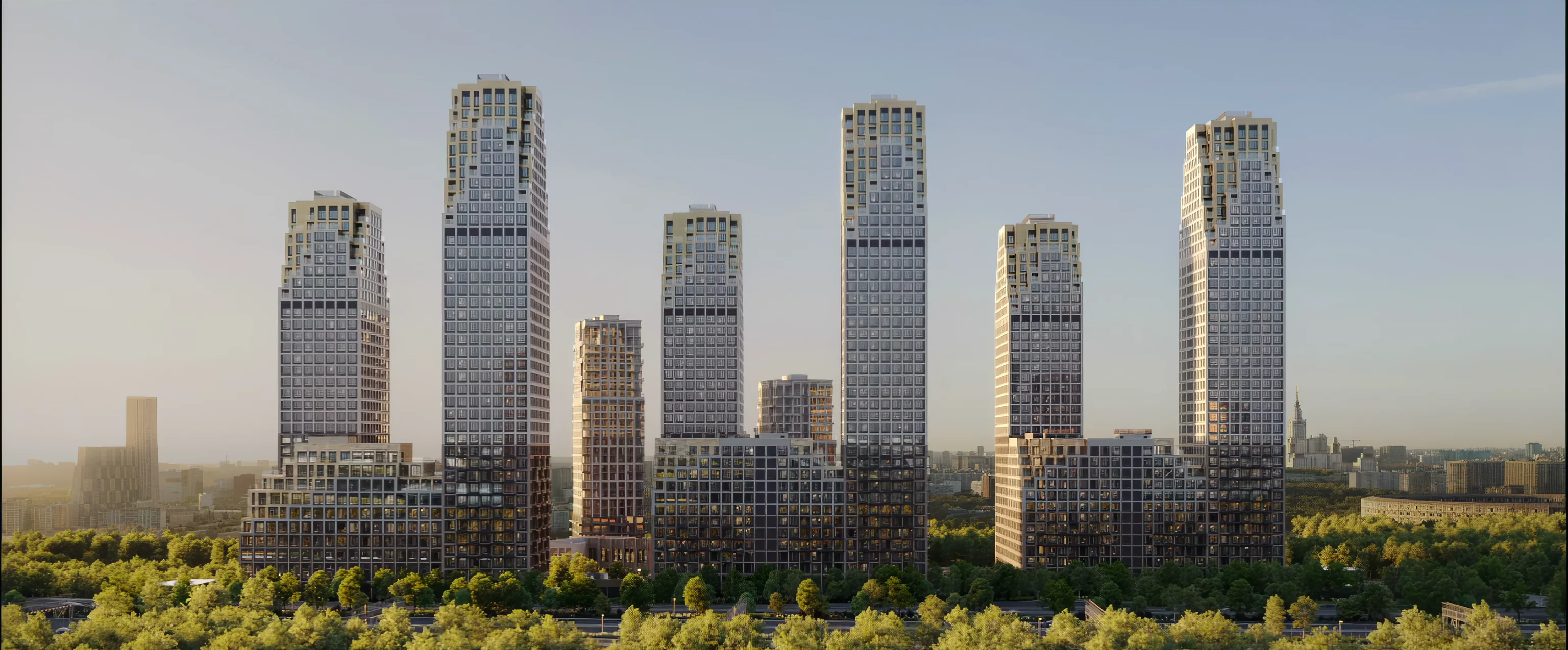
NOVA is six towers by the Dutch studio De Architekten Cie, rising from 10 to 40 floors like a mountain ridge above the river valley. The mountain runs through the brand language as a sign of rising above the everyday. In the posters and the 3D film the buildings are shown as the main exhibit of the collection.
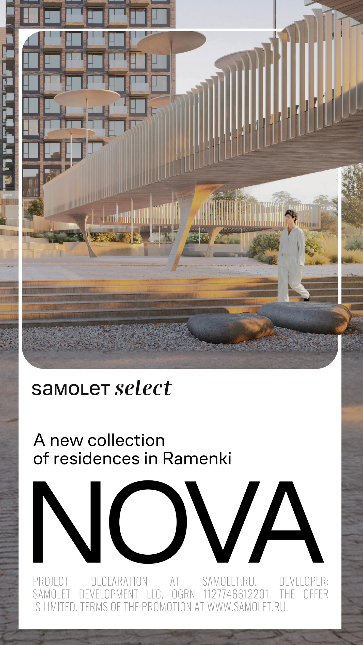
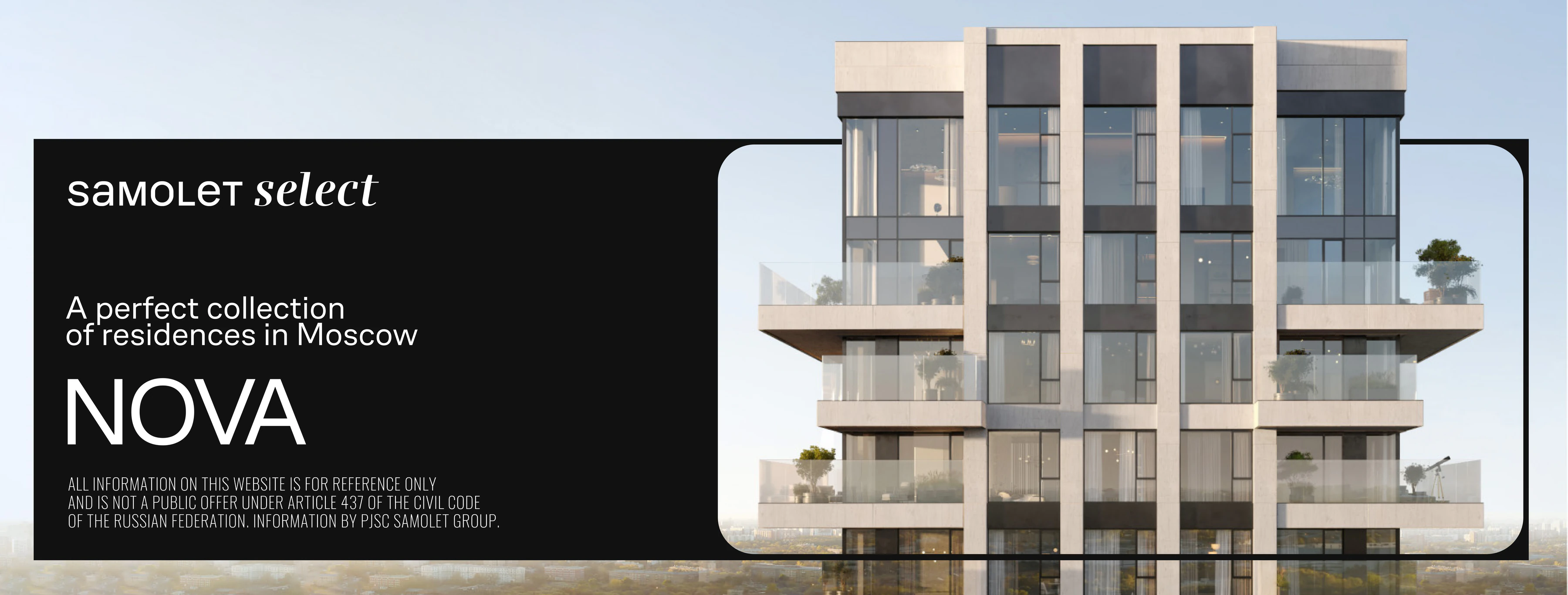
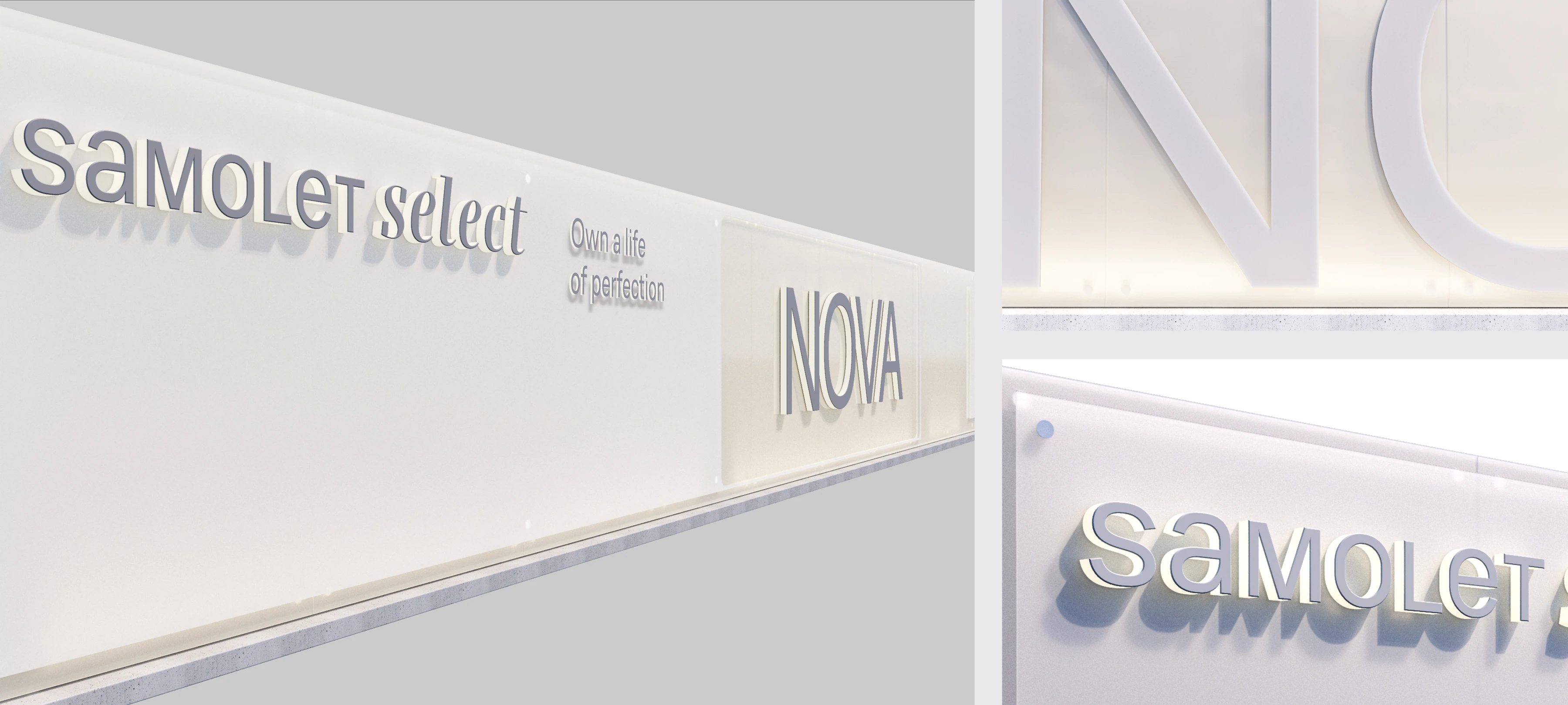
The building site is the first part of NOVA the city sees, years before the towers are finished. The hoarding is dressed as the facade of a gallery: calm white panels, raised lettering and the project shown in frames along the street. The line “Own a life of perfection” turns a construction fence into an invitation, so even the work in progress speaks the language of the collection.

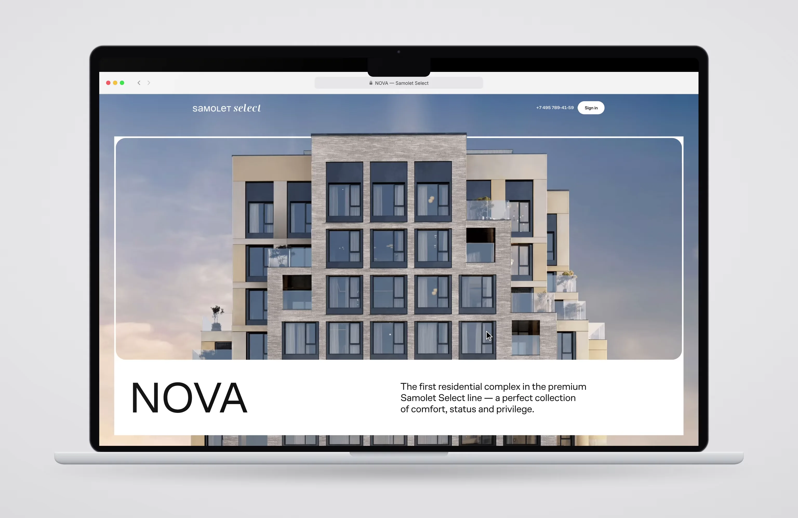
The website brings the frame into motion. On the first screen the frame stays still while the building moves beneath it, then the frame opens to the edges of the screen, as if the visitor steps inside. Further down the site becomes a calm tool for choosing a home: filters by number of rooms, a masterplan where each building opens its floors and available apartments, and layouts with a booking form for a visit.