0:00
0:00
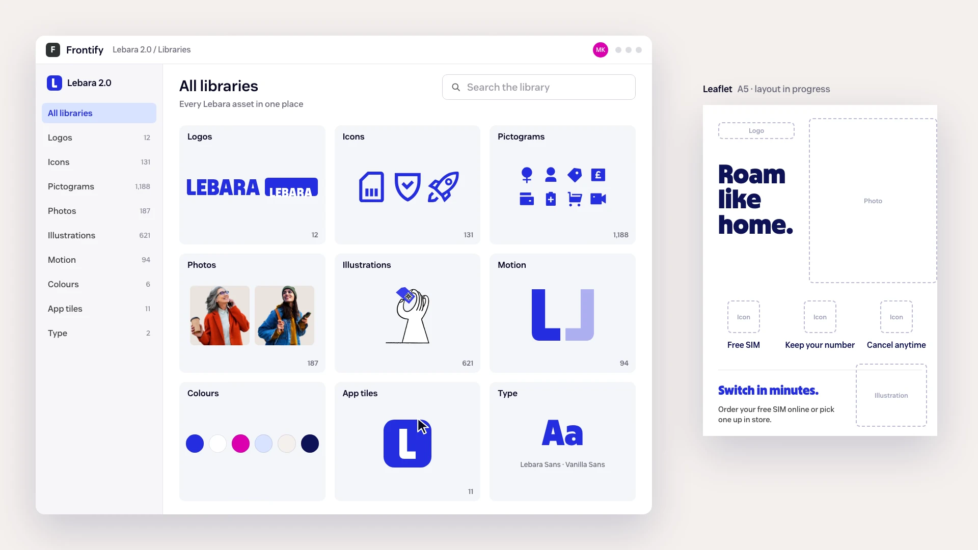
Lebara rebranded as a challenger: a smarter perspective on mobile. For a year we have carried the new brand into everyday work across five European markets, building the libraries it runs on and the files it lives in. Now we are turning those libraries into brand tools. They are in development.
UK, Netherlands, Germany, Denmark, France
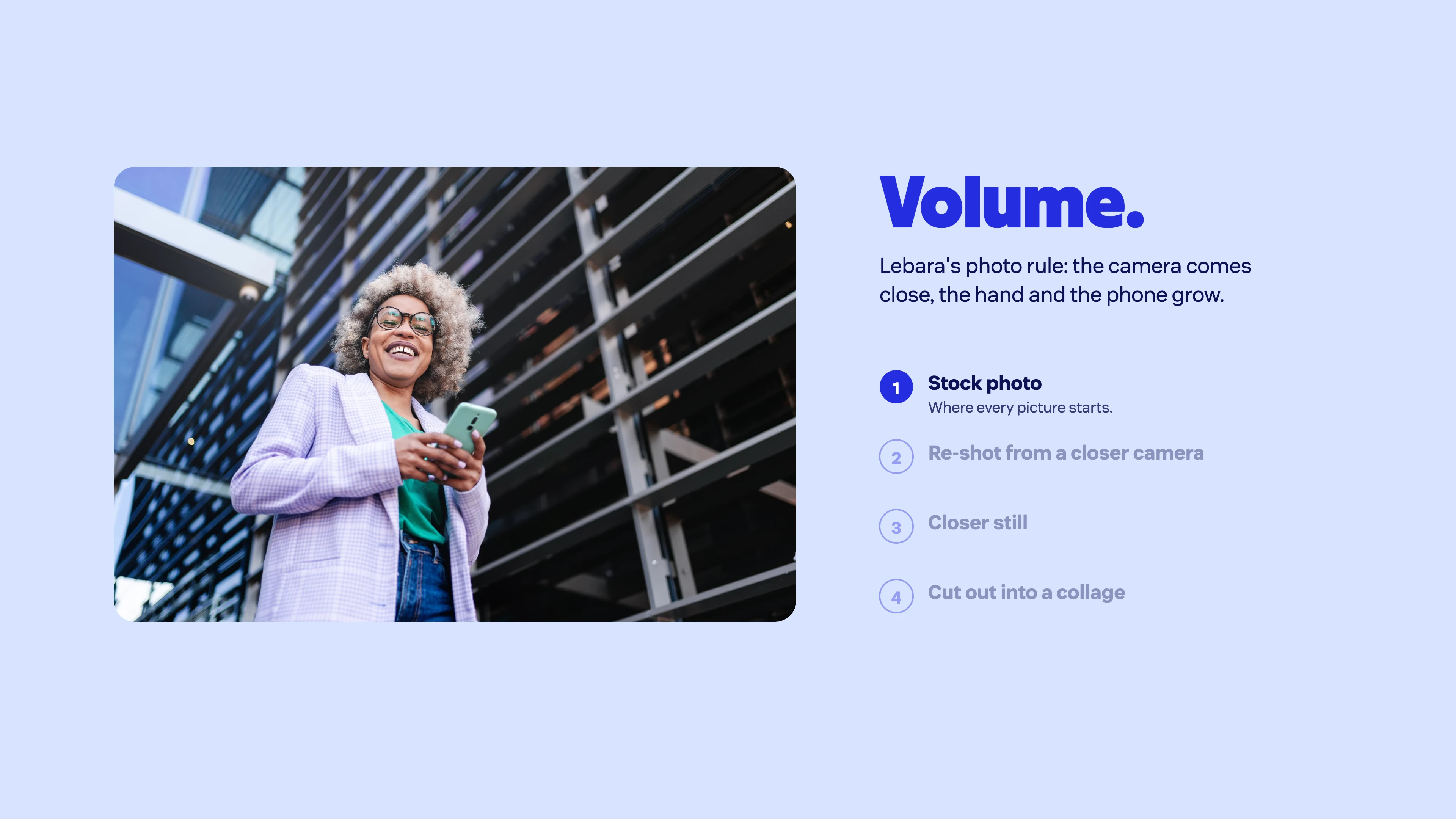
Photos in the Volume library
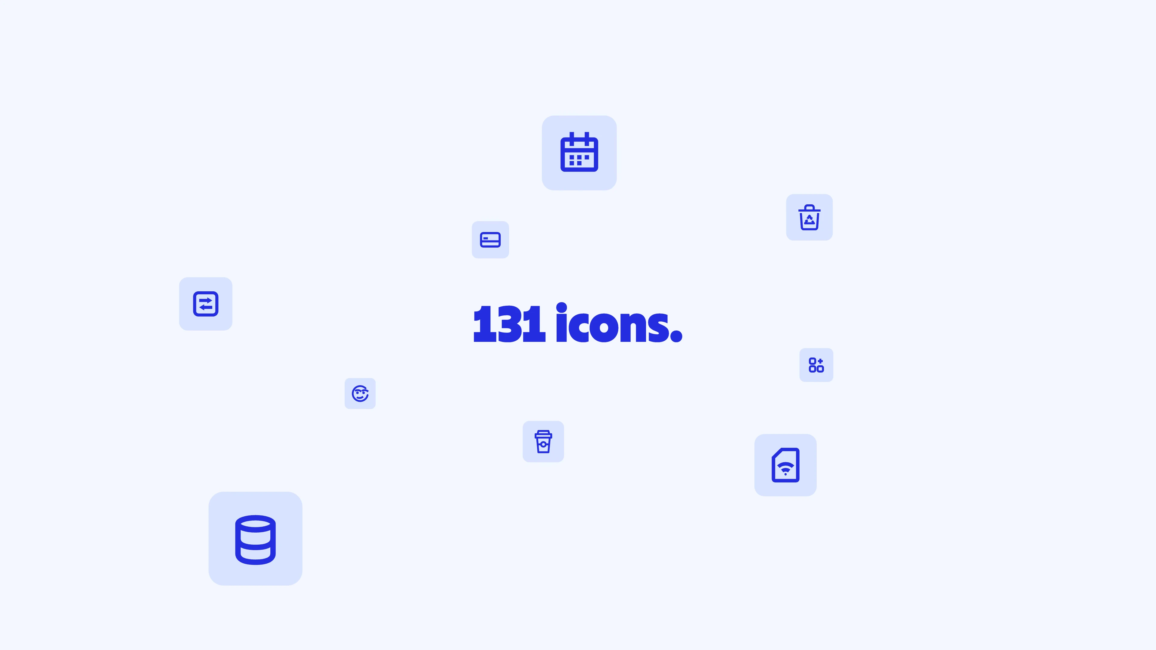
Icons in one library
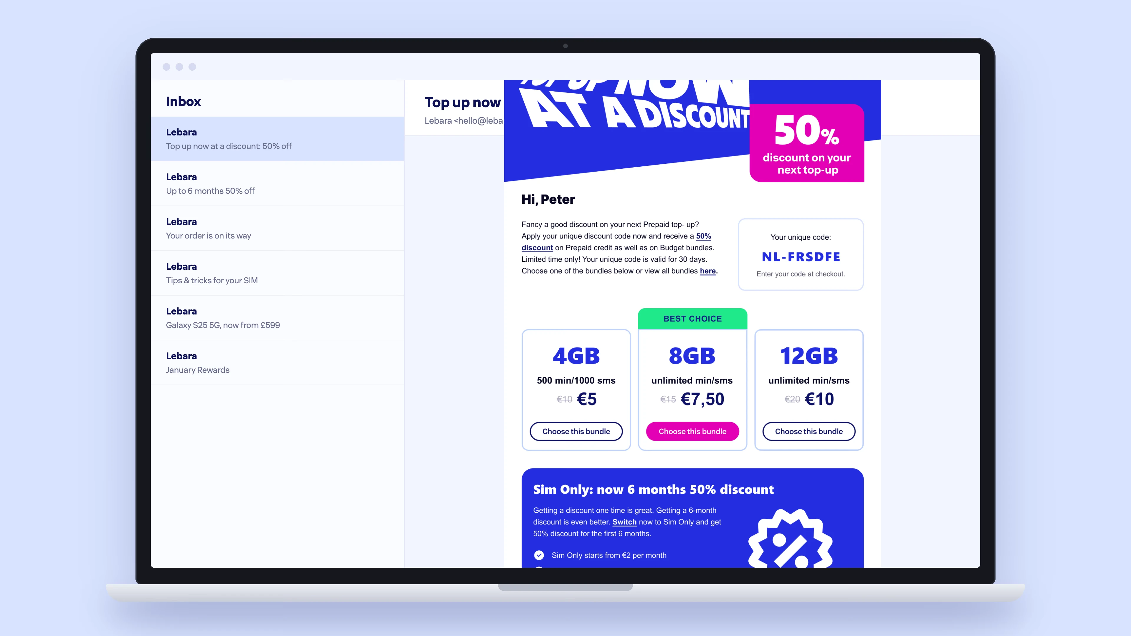
Email modules
A brand that grows by adding products needs a way to name them without breaking the logo. Instead of drawing every sub-brand by hand, we turned it into one rule: a label a third of the wordmark's height that ends on a letter stroke. Any team can now add Rewards, Phones or a new 5G offer, and it still reads as one Lebara.
Each market was drawing its own icons for the app, the site and the shops, and they had drifted apart. We redrew them as one family on one grid and one stroke, 131 so far, so a new feature or offer gets an icon that already belongs.
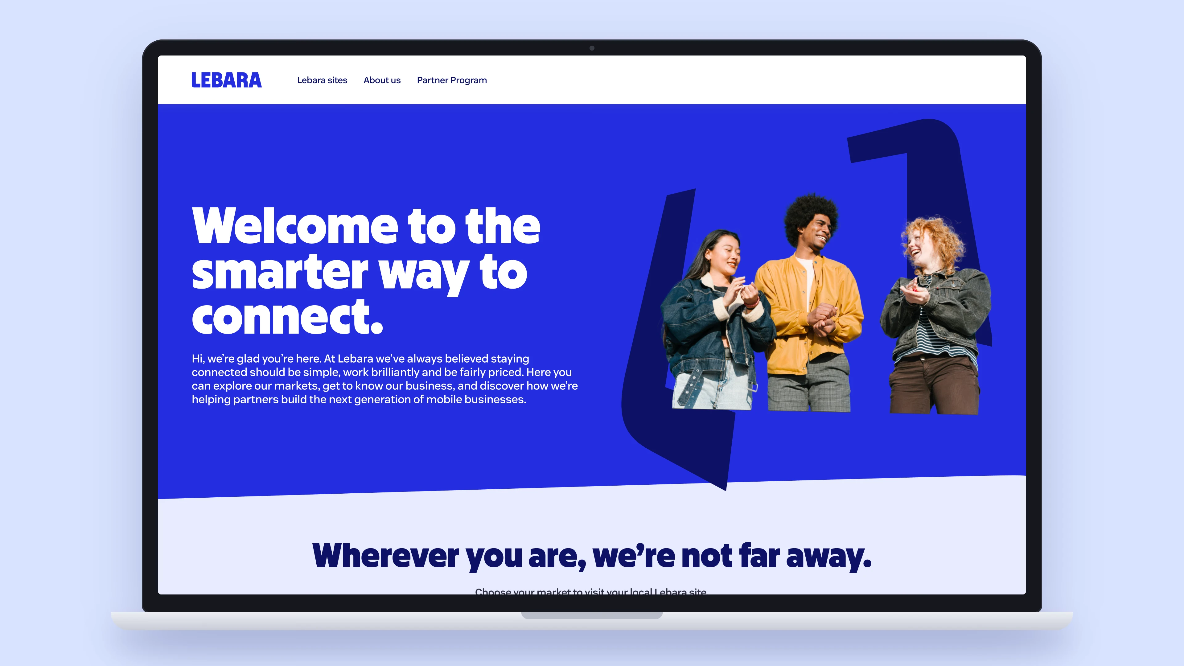
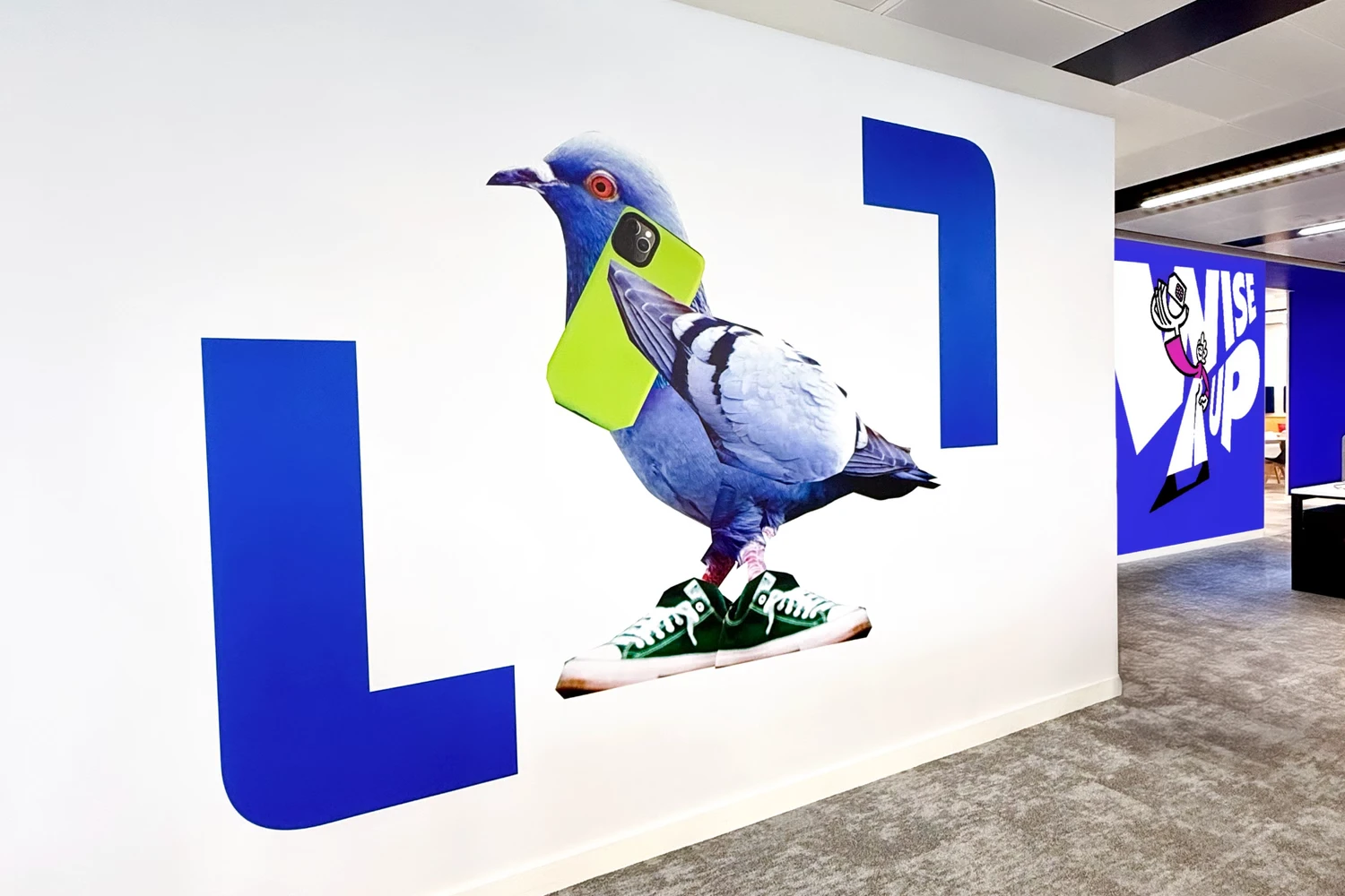
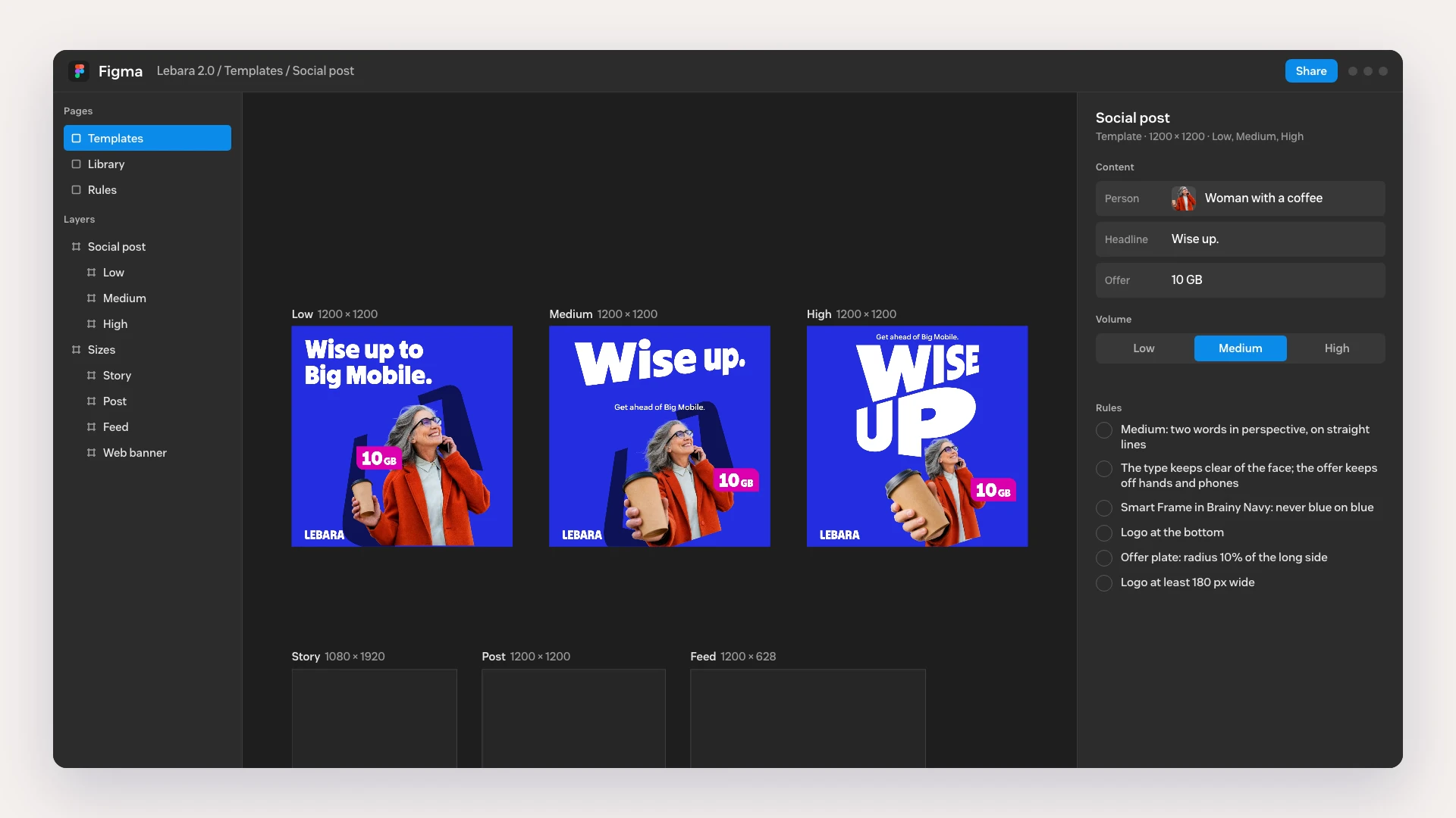
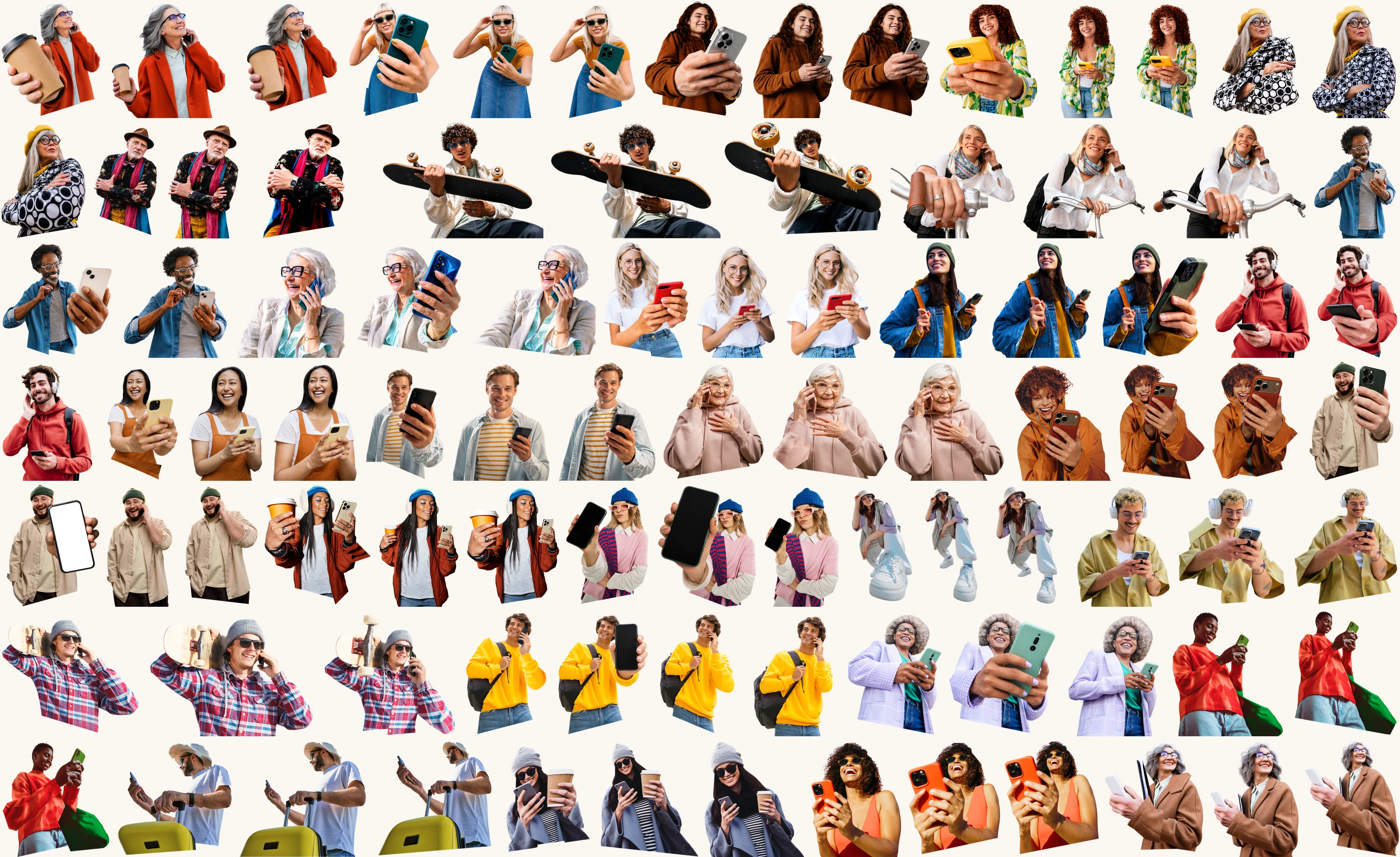
The new Lebara has a handheld effect with three levels of expression: Low is calm, Medium bends, High warps to the extreme. A launch needs it once; five markets need it every week. So we turned the look into a method: any stock photo is re-shot from a closer camera twice and cut out, and a library of 30 people and objects lets every team make a Volume picture at the level the message needs.
Each market sends its own offers, renewals and order confirmations, often put together by different people. A system of 144 modules lets any of them build an email that looks and reads like Lebara, without starting from a blank page.
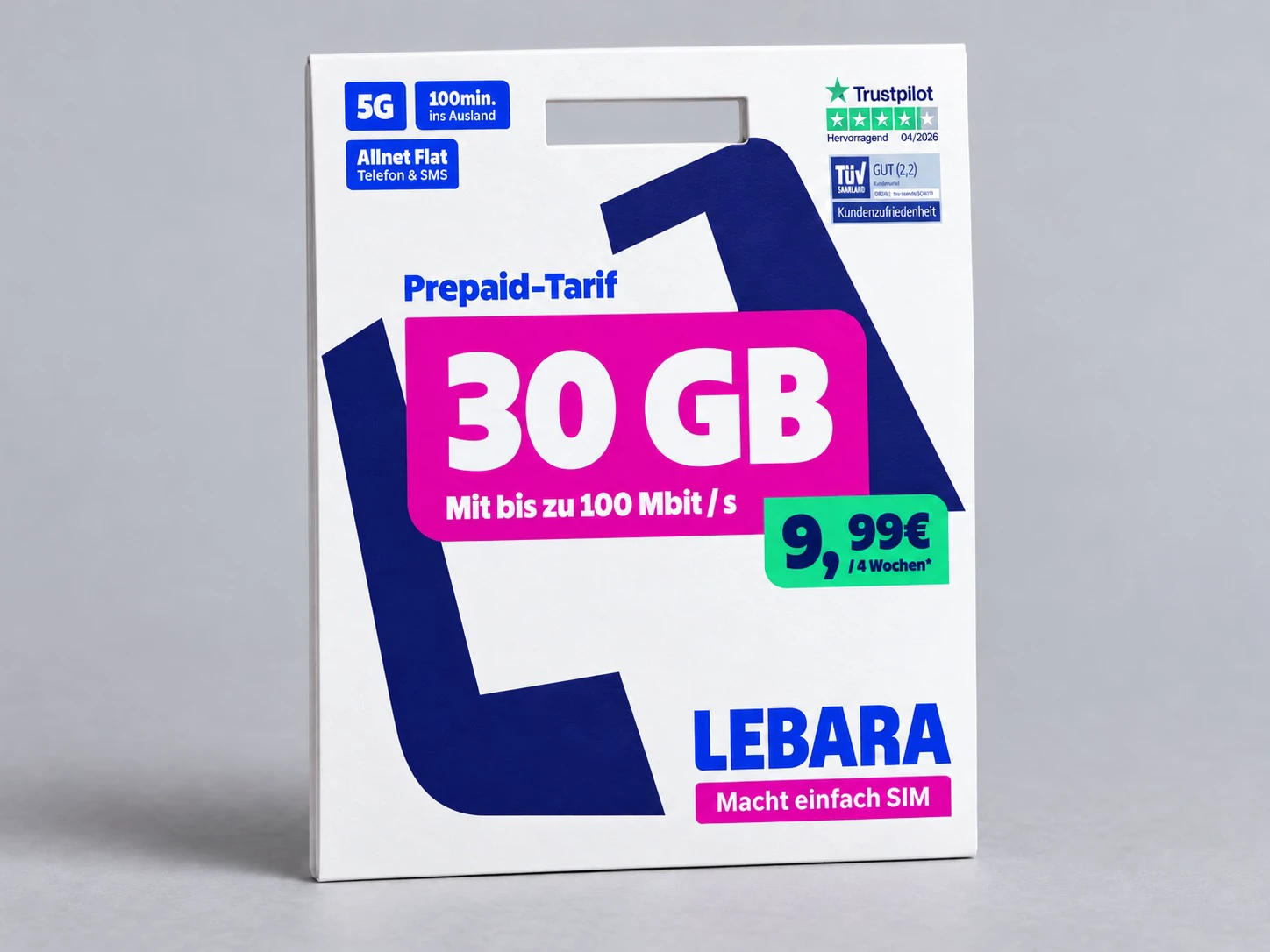
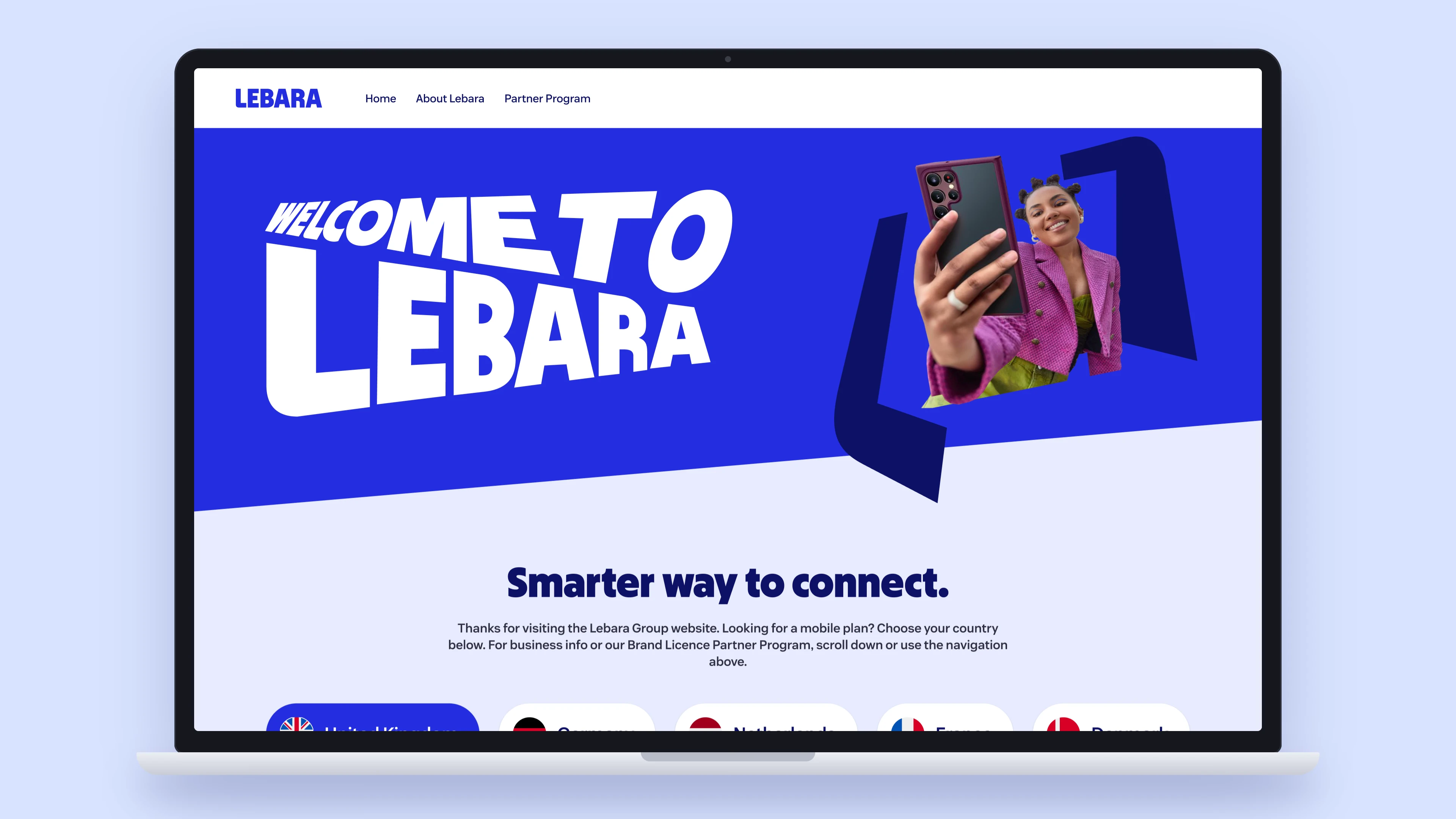
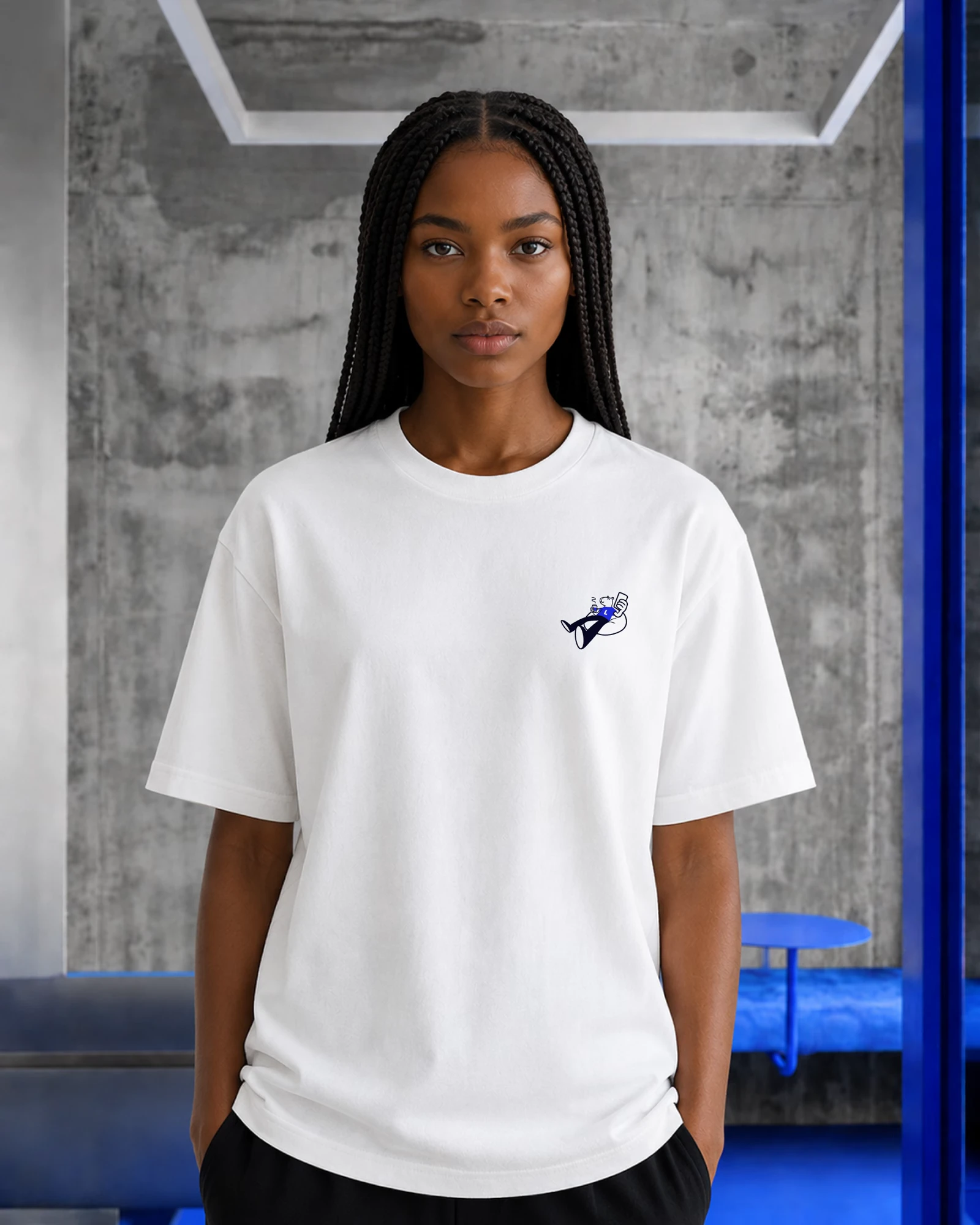
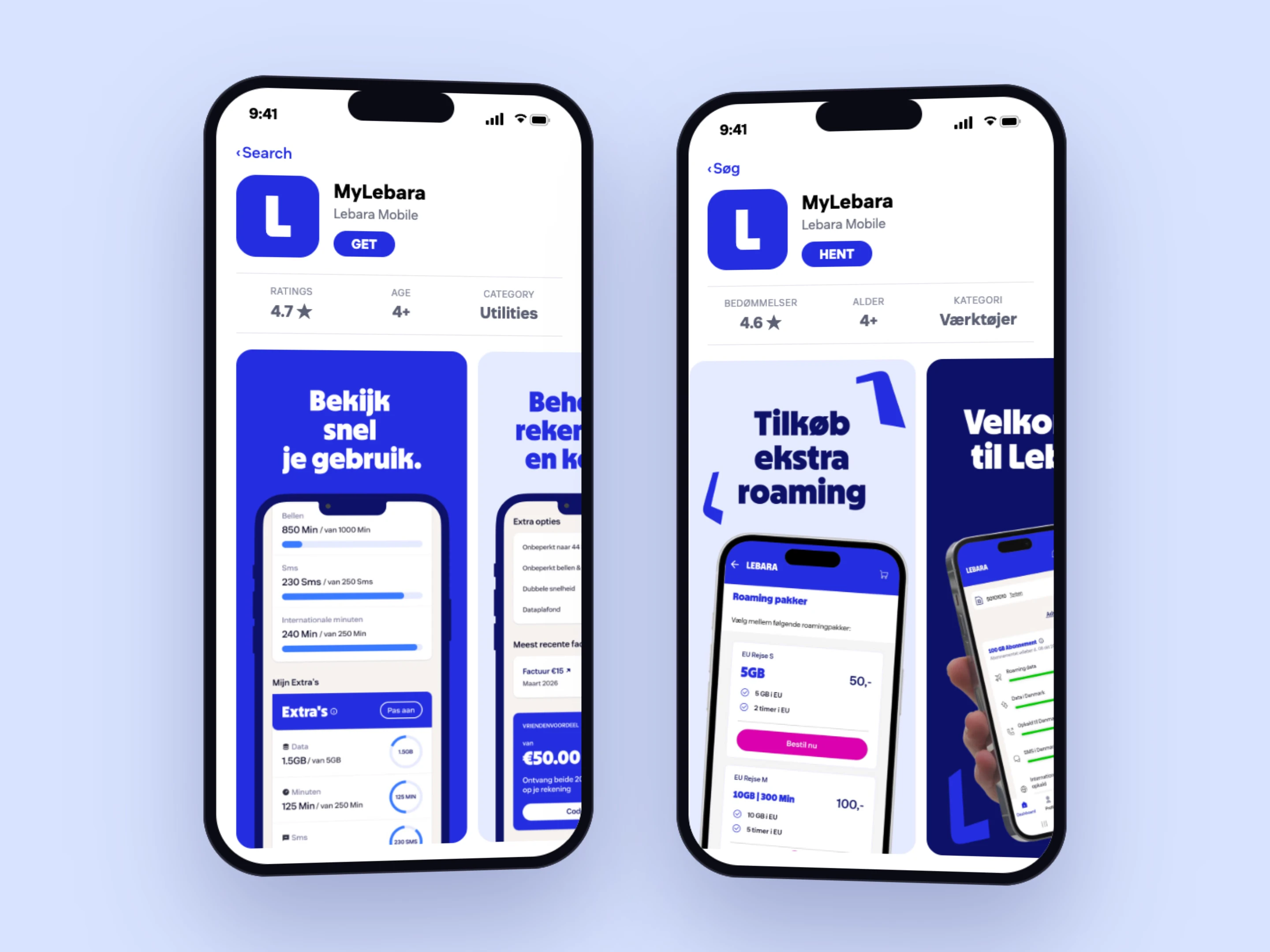
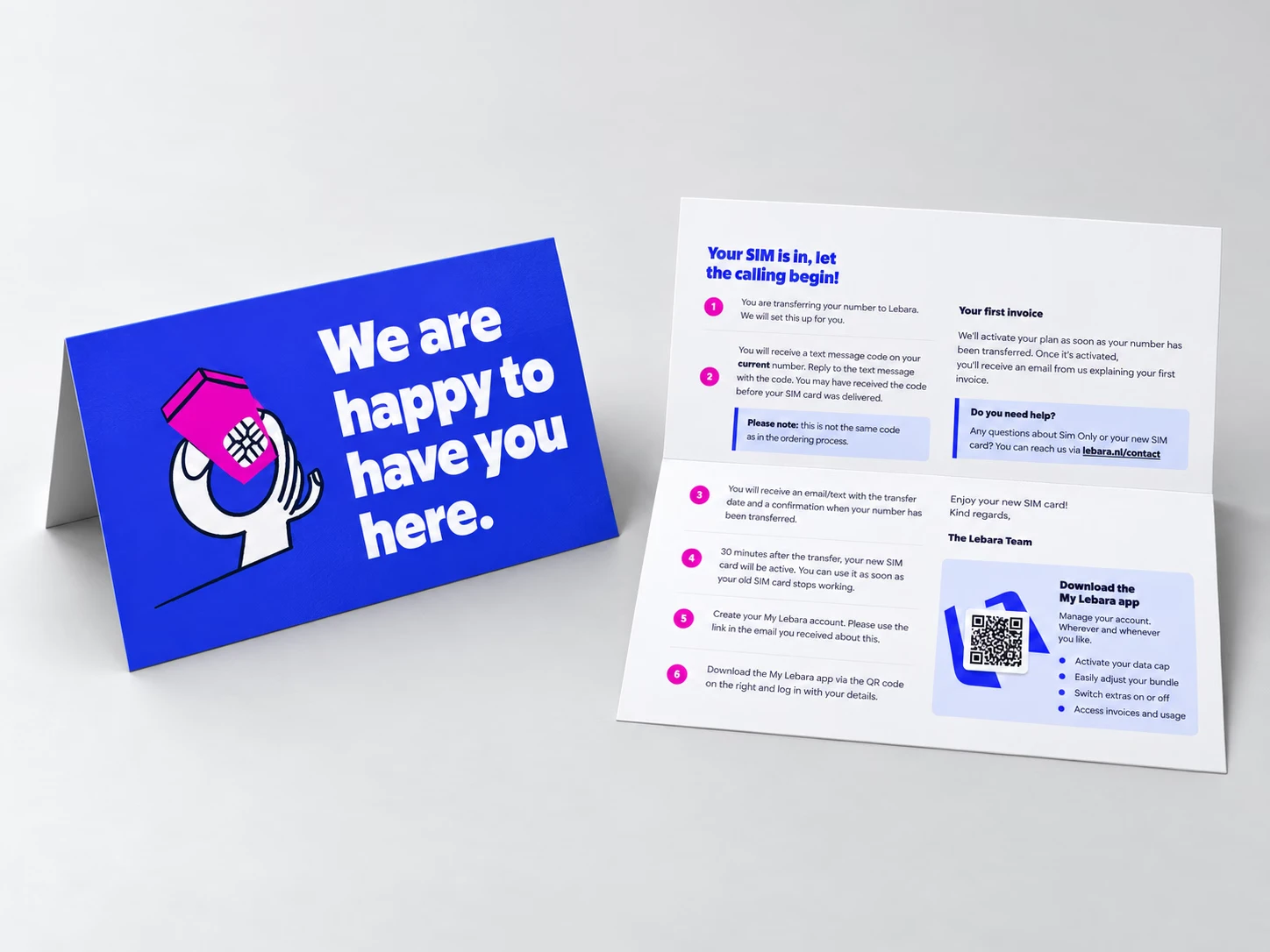
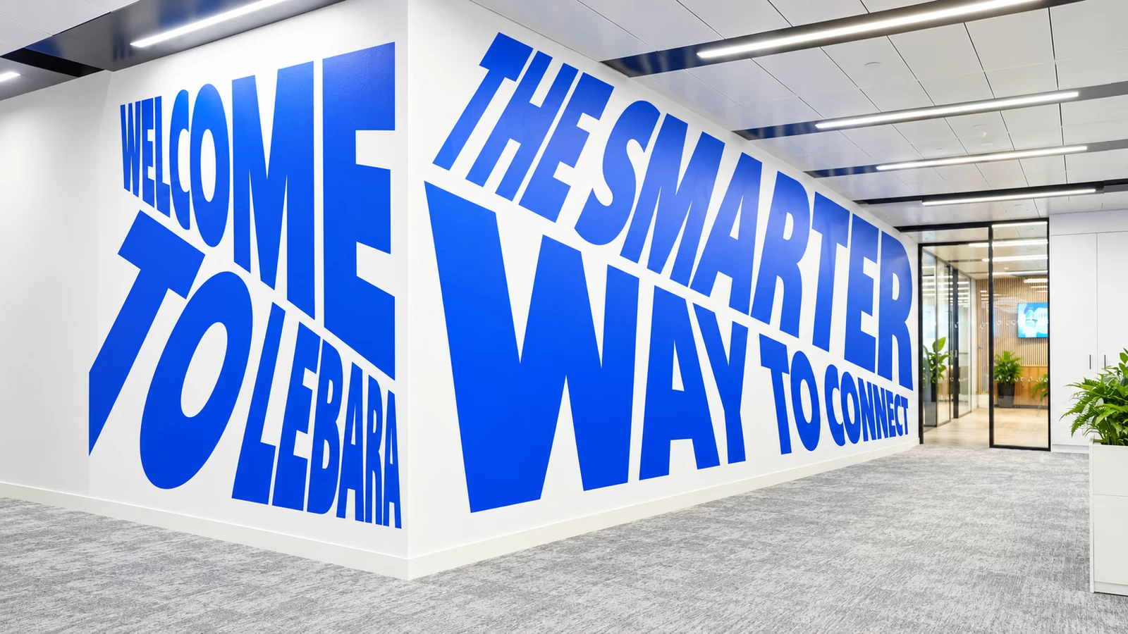
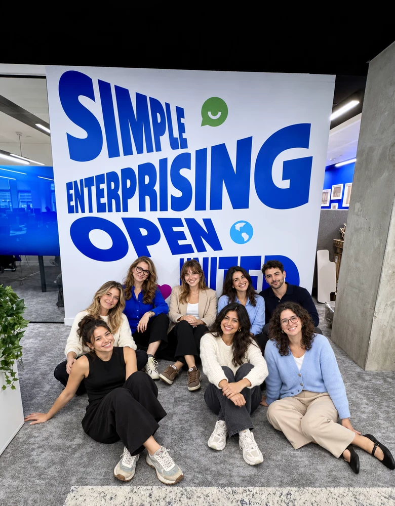
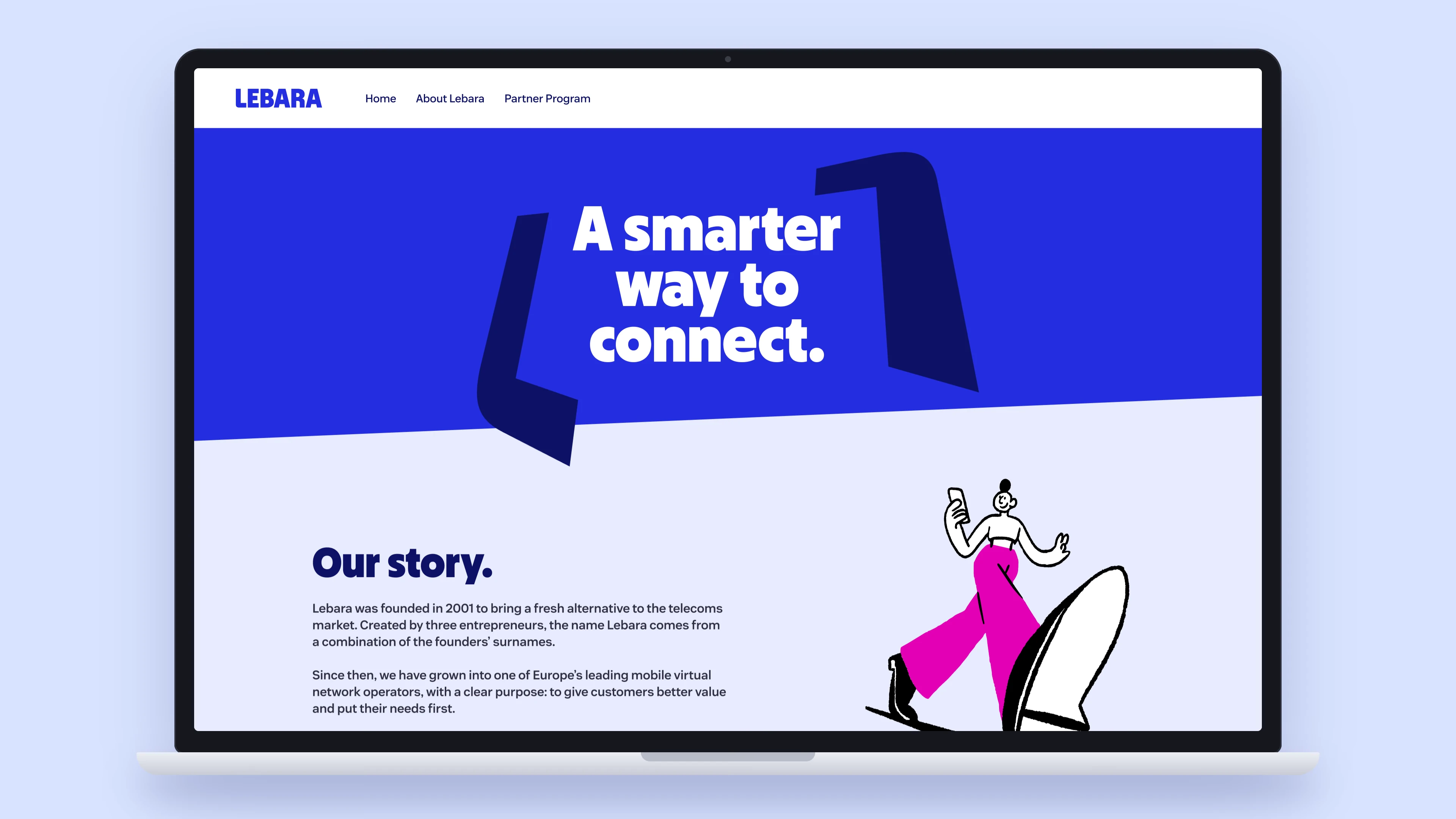
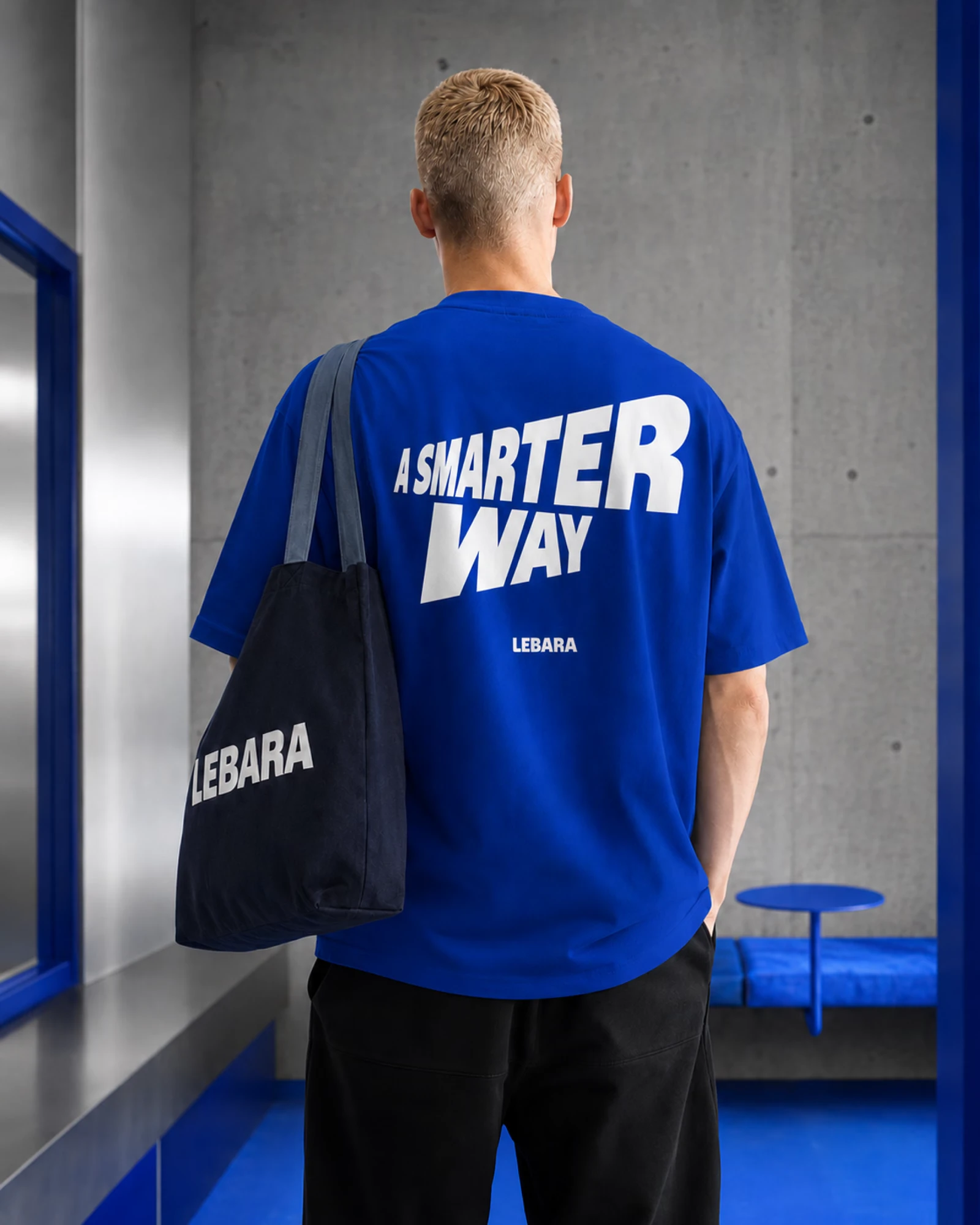
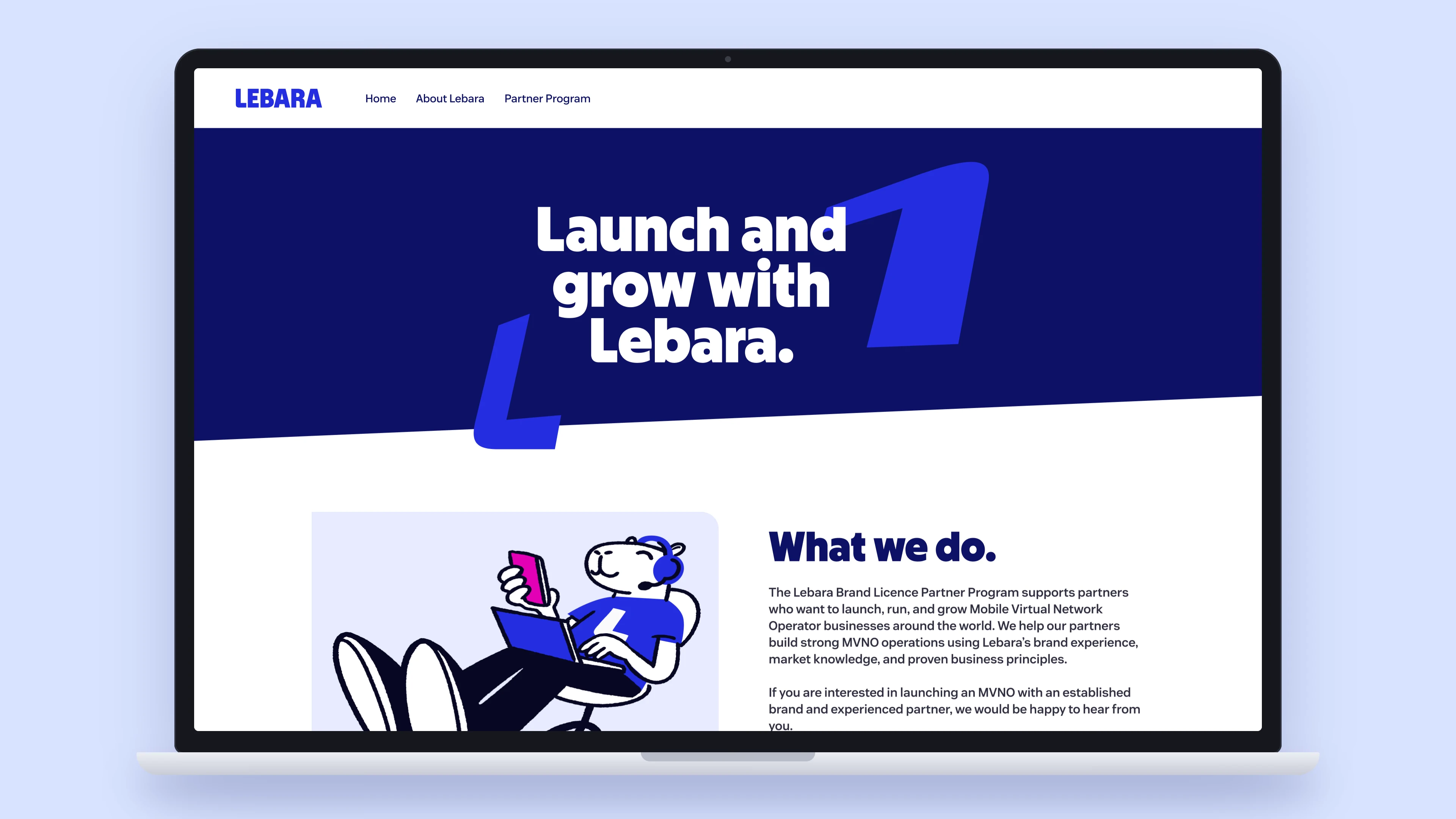
The new identity launched in the Netherlands and rolled out to Germany, France, Denmark and the UK. A rebrand is only real once it reaches the everyday: the SIM pack in a corner shop in Copenhagen, the store page someone sees before downloading the app, the leaflet at the till in Paris, the T-shirt at a team event, the walls of the London office. Every one of them runs on the same system, in each market's own language.
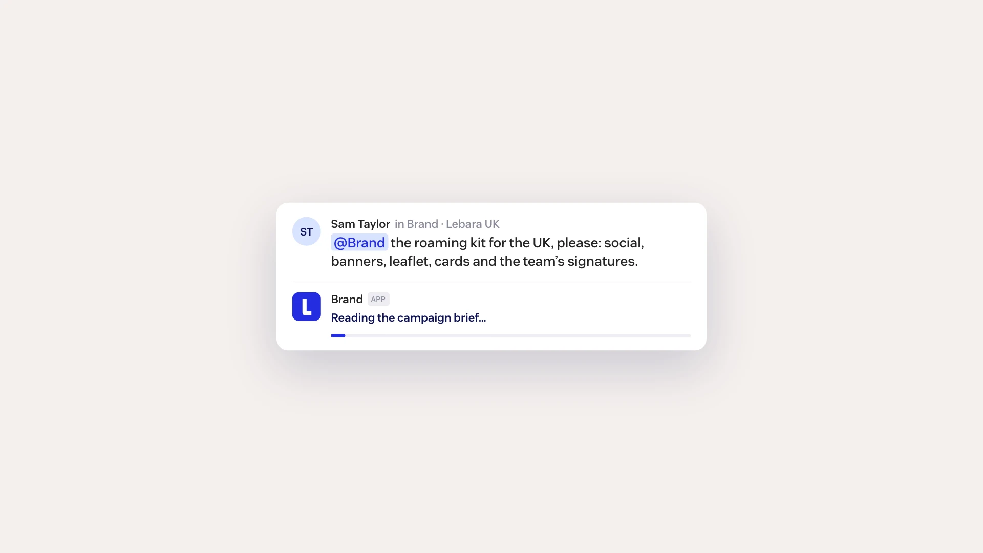
In development. The next step is to stop drawing the same files again and again. Everything above is now structured enough to run as software: the libraries feed templates, the templates make the files, and teams ask for them inside the tools they already use.
One brief becomes every size, every market and every language, with the copy kept in Lebara's tone at each volume.
The Volume method and the brand library, open to anyone in the company: ask for an icon, a cut-out or a sub-brand logo and get it in the right format.
The work no designer should be doing by hand: leaflets in the market's language, business cards and decks, email signatures and Teams backgrounds filled in from the work account.
One of these tools works right here. The banner generator knows the brand rules: write a headline, pick a person and move the volume from Low to High. It bends the type to the level, keeps it off faces and puts the frame in the right colour.